What is the "Positive Rate Dash"/"DDC Positive Rate" and why is it different from the other Positive Rate? #216
-
|
What are mean column Positive Rate Dash in file cases_by_province.csv |
Beta Was this translation helpful? Give feedback.
Replies: 1 comment
-
|
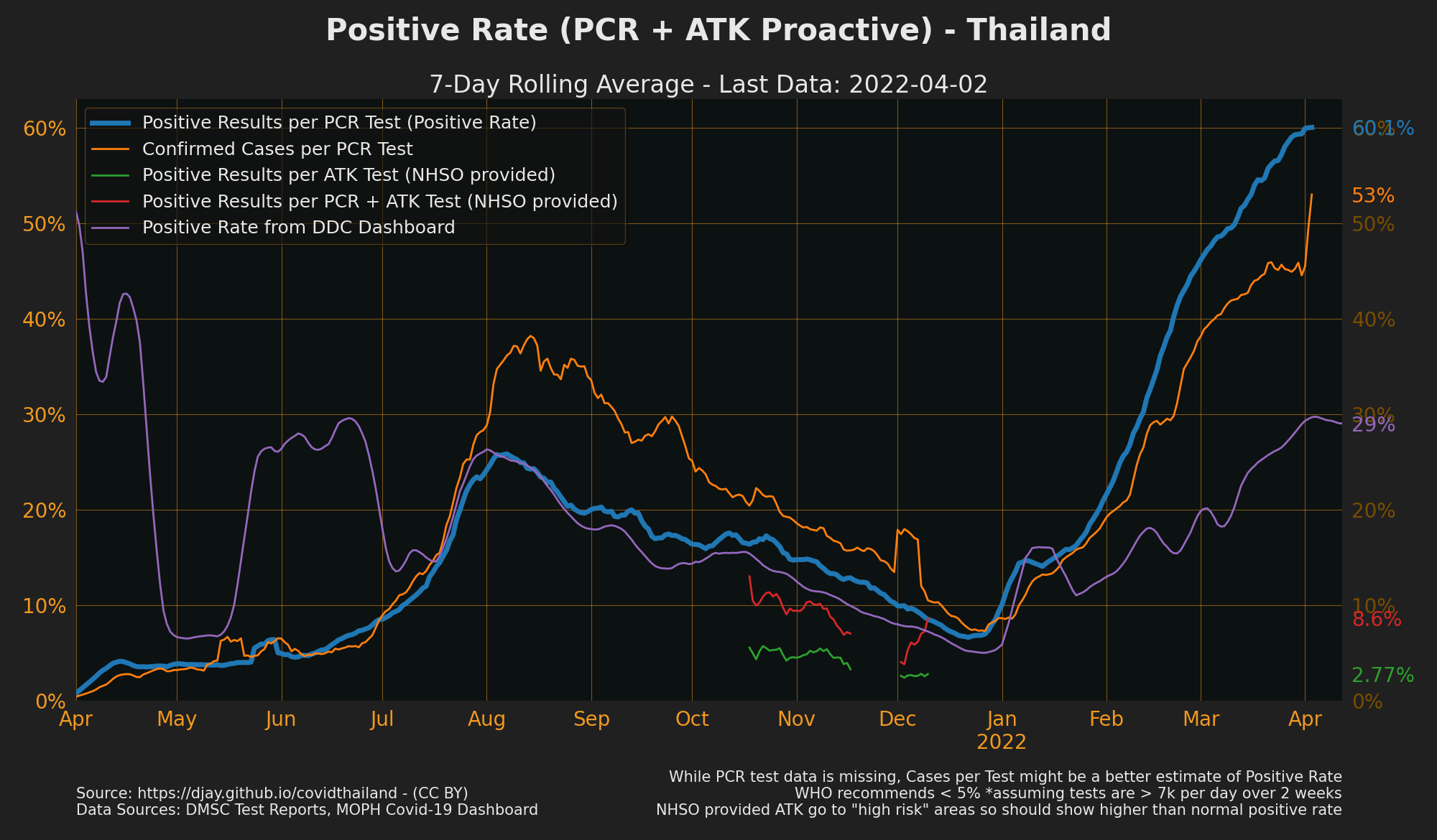
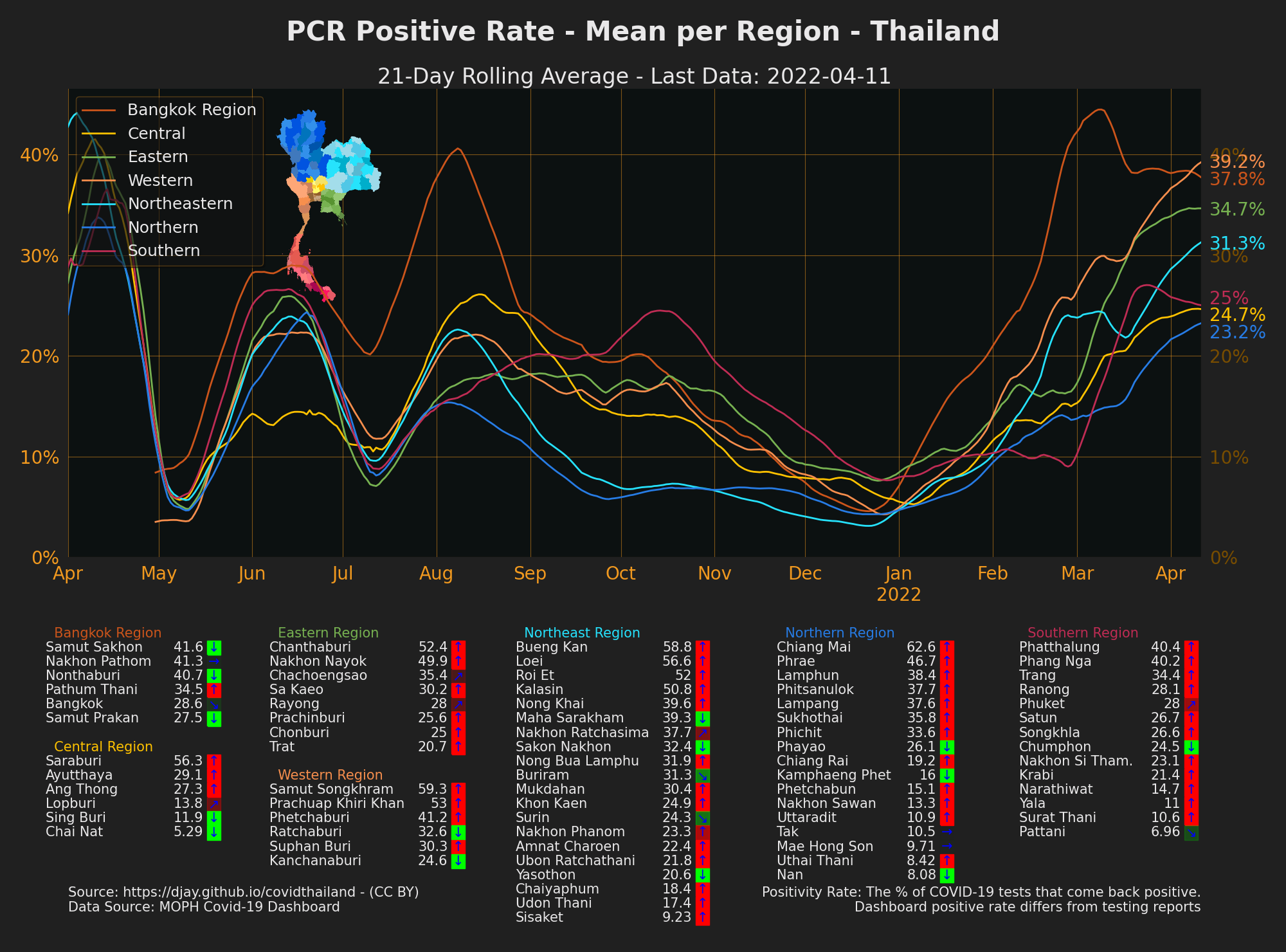
It's the positive rate as shown on the DDC dashboard. I've updated the downloads document. You can see them labeled more clearly in the plot It's unclear why ddc dashboard positive rate is consistently lower than the positive rate in the from the PCR test reports. Without knowing the process to collect each, both could be incomplete data but in different ways. If anyone knows, please let me know. Even though DDC positive rate is lower, since the data is available per province it allows us to see trends geographically, even if the numbers are unlikely to be accurate. |
Beta Was this translation helpful? Give feedback.


It's the positive rate as shown on the DDC dashboard. I've updated the downloads document.
You can see them labeled more clearly in the plot
It's unclear why ddc dashboard positive rate is consistently lower than the positive rate in the from the PCR test reports. Without knowing the process to collect each, both could be incomplete data but in different ways. If anyone knows, please let me know.
Even though DDC positive rate is lower, since the data is available per province it allows us to see trends geographically, even if the numbers are unlikely to be accurate.