This project is a carousel sliders pack with different types for the Flet framework. This project is under development, so in the future, different types of sliders will be added to the project.
pip install fletcarouselor
git clone https://github.com/naderidev/flet-carouselThere are some types of sliders, so in the following, we will explain each type of them.
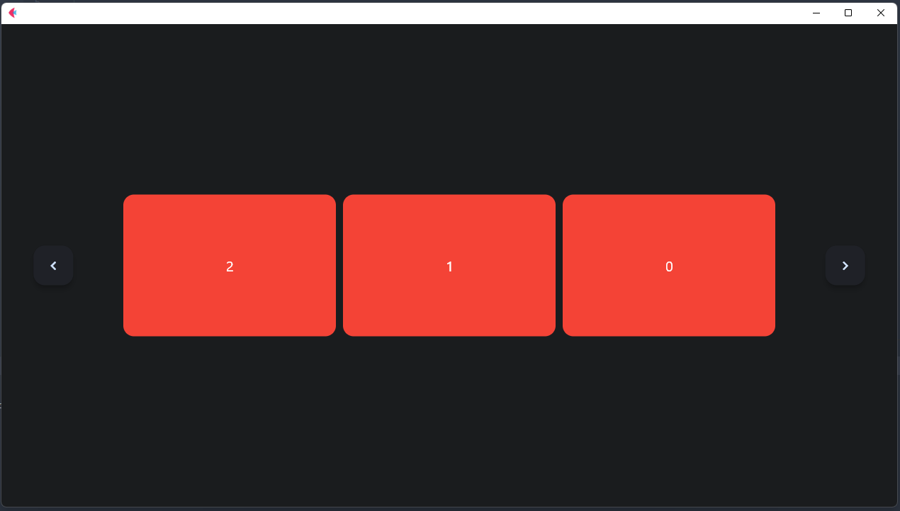
This type of slider is the basic one. This type is horizontal and there are two buttons to control slides.
for example:
BasicHorizontalCarousel(
    page=page,
    items_count=3,
    # auto_cycle=AutoCycle(duration=1),
    items=[
        Container(
            content=Text(value=str(i), size=20),
            height=200,
            width=300,
            bgcolor='red',
            border_radius=15,
            alignment=alignment.center,
        ) for i in range(10)
    ],
    buttons=[
        FloatingActionButton(
            icon=icons.NAVIGATE_BEFORE,
            bgcolor='#1f2127'
        ),
        FloatingActionButton(
            icon=icons.NAVIGATE_NEXT,
            bgcolor='#1f2127'
        )
    ],
    vertical_alignment=CrossAxisAlignment.CENTER,
    items_alignment=MainAxisAlignment.CENTER
)page
the main page
-
width: slider width -
height:slider height -
expand: filling available space -
tooltip: tooltip -
disabled: disabled -
padding: padding -
margin: margin -
alignment: alignment -
bgcolor: background color -
gradient: gradient -
border: border -
border_radius: border_radius
-
items: the items that you want to be in slide show -
items_count: the count of controls in each slide -
vertical_alignment: items vertical_alignment -
items_alignment: items alignment -
spacing: spacing between items -
auto_cycle: auto cycleing (Auto changing slides) -
buttons: the list of Slider's buttons that must be two buttons! the first one is the "previous" button and the second is the "next" button
-
next: next slide -
prev: previous slide -
update_items: updating items -
reset_items_index: reseting items index
check out the file examples/flet_carousel_basic.py
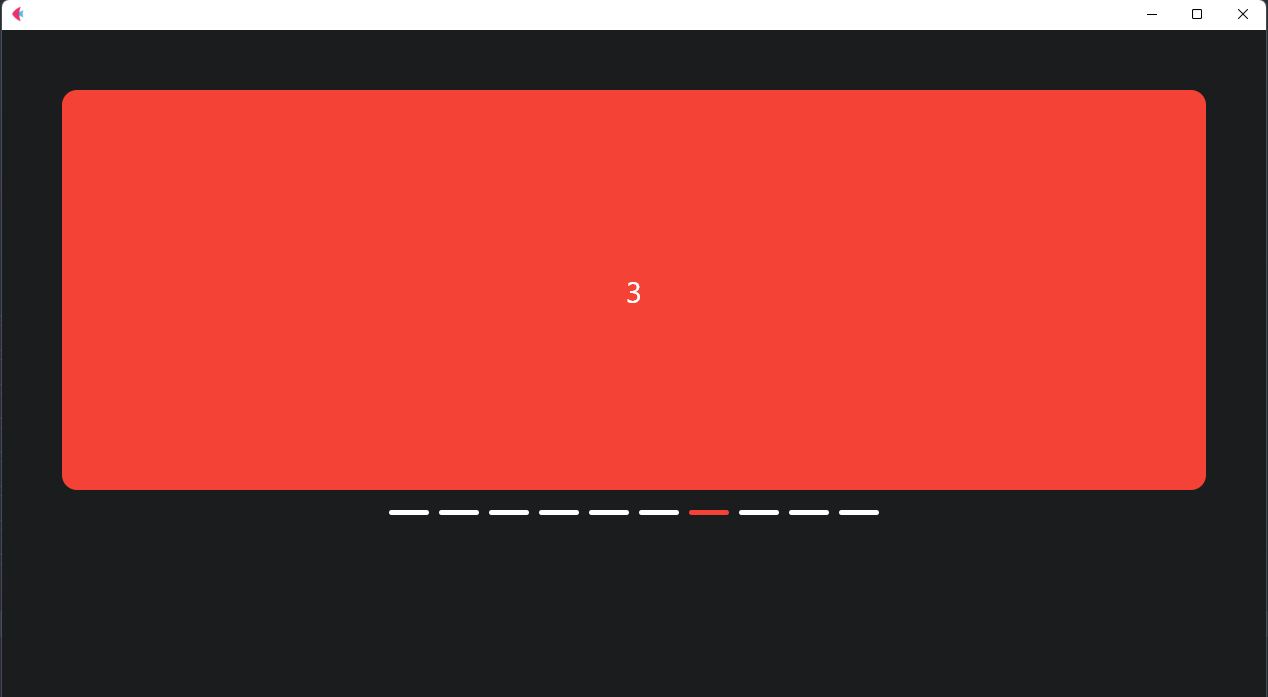
This type of slider works with AnimatedSwitcher and unlike "BasicHorizontalCarousel" has no next and prev button but has hint lines.
for example:
BasicAnimatedHorizontalCarousel(
    page=page,
    auto_cycle=AutoCycle(duration=2),
    expand=True,
    padding=50,
    hint_lines=HintLine(
        active_color='red',
        inactive_color='white',
        alignment=MainAxisAlignment.CENTER,
        max_list_size=400
    ),
    items=[
        Container(
            content=Text(value=str(i), size=30),
            height=400,
            expand=True,
            bgcolor='red',
            border_radius=15,
            alignment=alignment.center,
        ) for i in range(10)
    ],
)page
the main page
-
width: slider width -
height:slider height -
expand: filling available space -
tooltip: tooltip -
disabled: disabled -
padding: padding -
margin: margin -
alignment: alignment -
bgcolor: background color -
gradient: gradient -
border: border -
border_radius: border_radius
-
items: the items that you want to be in slider -
hint_lines: hint lines settings -
animated_switcher: The AnimatedSwitcher settings -
auto_cycle: auto cycleing (Auto changing slides)
-
next: next slide -
prev: previous slide -
update_items: updating items -
go: go to a specific slide
check out the file examples/animated_horizontal_basic.py
Hope to enjoy :)

