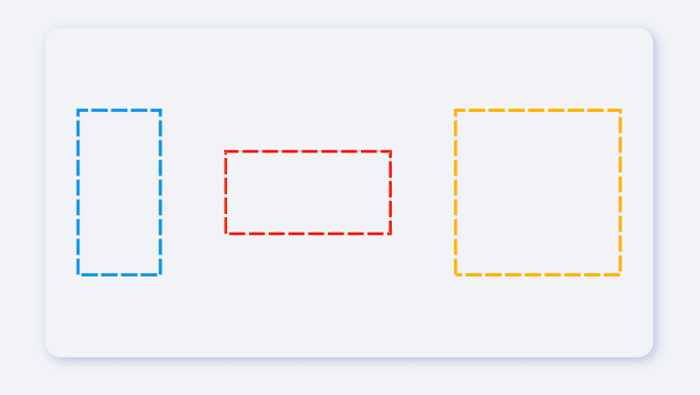
Use the easiest way to create a dotted line view 👀!
[FDottedLine] provides developers with the ability to create dashed lines. It also supports creating a dashed border for a [Widget]. Support for controlling the thickness, spacing, and corners of the dotted border.
Author:Newton(coorchice.cb@alibaba-inc.com)
English | 简体中文
Like it? Please cast your Star 🥰 !
-
Supports dotted lines in both horizontal and vertical directions
-
Support to create dashed shapes
-
Provide super easy way to add dotted border to Widget
-
Support creating flexible dotted corner effects
| Param | Type | Necessary | Default | desc |
|---|---|---|---|---|
| color | Color | false | Colors.black |
Dotted line color |
| height | double | false | null | height. If there is only [height] and no [width], you will get a dotted line in the vertical direction.If there are both [width] and [height], you will get a dotted border. |
| width | double | false | null | width. If there is only [width] and no [height], you will get a dotted line in the horizontal direction.If there are both [width] and [height], you will get a dotted border. |
| strokeWidth | double | false | 1.0 | The thickness of the dotted line |
| dottedLength | double | false | 5.0 | The length of each small segment in the dotted line |
| space | double | false | 3.0 | The distance between each segment in the dotted line |
| corner | FDottedLineCorner | false | null | The corners of the dotted border. See [FDottedLineCorner] for details |
| child | Widget | false | null | If [child] is set, [FDottedLine] will serve as the dotted border of [child].At this time, [width] and [height] will no longer be valid. |
FDottedLine(
  color: color,
  width: 160.0,
  strokeWidth: 2.0,
  dottedLength: 10.0,
  space: 2.0,
)
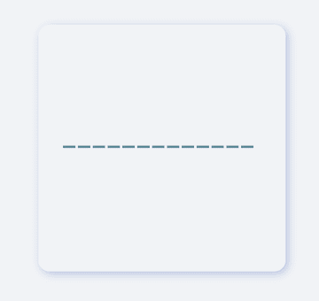
It is very simple to create a horizontal dotted line through FDottedLine.
The developer only needs to set the width parameter, but not the height parameter, which is all the developer needs to do for this.
If you want to control the thickness of the dotted line, set strokeWidth.
Through the dottedLength and space parameters, developers can freely control the length of each small segment in the dotted line and the distance between them.
FDottedLine(
  color: color,
  height: 160.0,
  strokeWidth: 2.0,
  dottedLength: 10.0,
  space: 2.0,
)
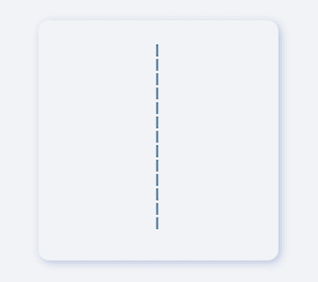
If you want to create a dotted line in the vertical direction, it is also very simple.
Developers only need to assign a value to height and leave width to be null or 0.
FDottedLine(
  color: Colors.lightBlue[600],
  height: 100.0,
  width: 50,
  strokeWidth: 2.0,
  dottedLength: 10.0,
  space: 2.0,
)
FDottedLine can not only create simple dotted lines 🌝.
When developers assign values to both width and height, they will be able to get a dotted rectangle! It's incredible.
FDottedLine(
  color: Colors.lightBlue[600],
  height: 70.0,
  width: 70.0,
  strokeWidth: 2.0,
  dottedLength: 10.0,
  space: 2.0,

  /// Set corner
  corner: FDottedLineCorner.all(50),
)
With FDottedLine, developers can even create corner effects of dashed rectangles. For example: dotted rounded rectangle, dotted round...
FDottedLine(
  color: color,
  strokeWidth: 2.0,
  dottedLength: 8.0,
  space: 3.0,
  corner: FDottedLineCorner.all(6.0),

  /// add widget
  child: Container(
    color: Colors.blue[100],
    width: 130,
    height: 70,
    alignment: Alignment.center,
    child: Text("0873"),
  ),
)
In the past, it was very difficult to add a dotted border to a Widget.
Because the official did not provide us with a good solution. But now, FDottedLine makes things easier than ever. Developers only need to use their Widget as a child of FDottedLine.
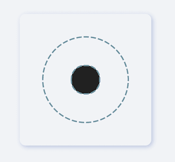
/// #1
FDottedLine(
  color: color,
  strokeWidth: 2.0,
  dottedLength: 8.0,
  space: 3.0,
  corner: FDottedLineCorner.all(75.0),
  child: Container(
    width: 130,
    height: 130,
    alignment: Alignment.center,
    /// #2
    child: FDottedLine(
      color: color,
      strokeWidth: 2.0,
      dottedLength: 8.0,
      space: 3.0,
      corner: FDottedLineCorner.all(20.0),
      child: Container(
        width: 43.0,
        height: 43.0,
        color: Colors.grey[900],
      ),
    ),
  ),
)
This also means that through the nesting of FDottedLine, many super interesting views can be created.
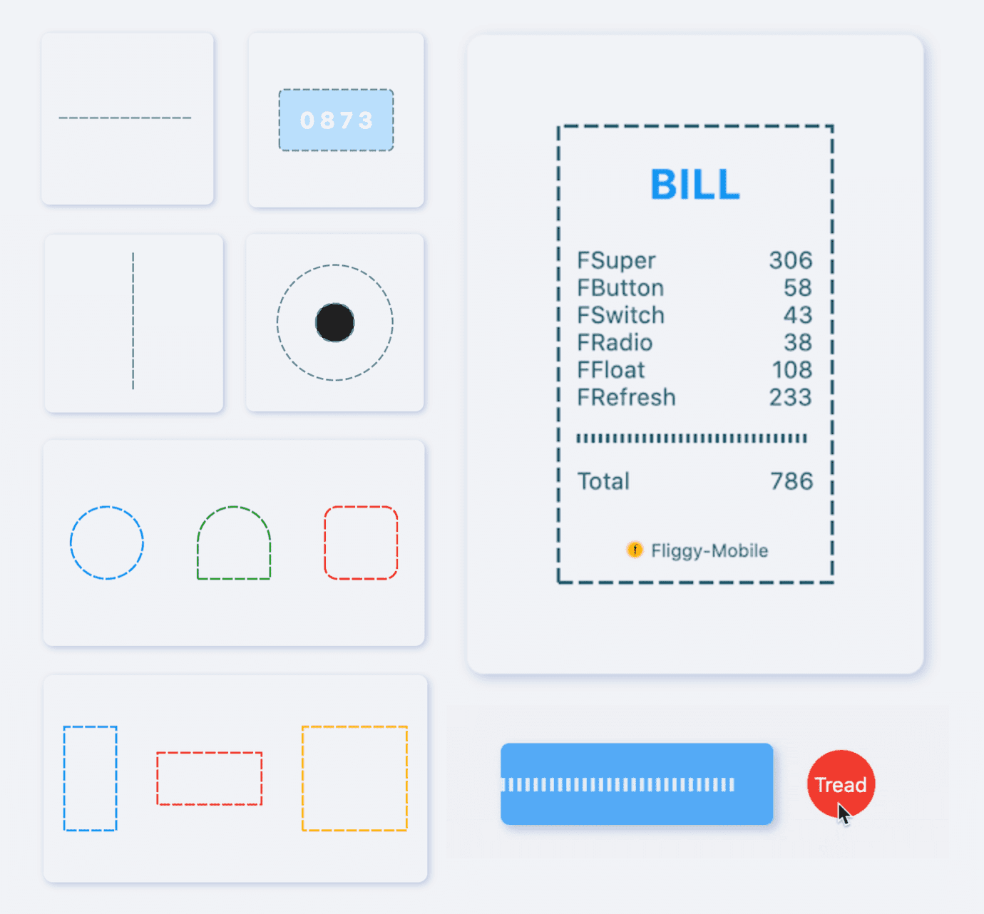
See what FDottedLine can do!
When there is such a simple way to create a dotted line, developers can freely build more wonderful views.
More about the application of FDottedLine , look forward to the exploration of developers 🔆.
Add dependencies in the project pubspec.yaml file:
dependencies:
  fdottedline: ^<version number>
⚠️ Attention,please go to [pub] (https://pub.dev/packages/fdottedline) to get the latest version number of FDottedLine
dependencies:
  fdottedline:
    git:
      url: 'git@github.com:Fliggy-Mobile/fdottedline.git'
      ref: '<Branch number or tag number>'
⚠️ Attention,please refer to [FDottedLine] (https://github.com/Fliggy-Mobile/fdottedline) official project for branch number or tag.
Copyright 2020-present Fliggy Android Team <alitrip_android@list.alibaba-inc.com>.

Licensed under the Apache License, Version 2.0 (the "License");
you may not use this file except in compliance with the License.
You may obtain a copy of the License at following link.

    http://www.apache.org/licenses/LICENSE-2.0

Unless required by applicable law or agreed to in writing, software
distributed under the License is distributed on an "AS IS" BASIS,
WITHOUT WARRANTIES OR CONDITIONS OF ANY KIND, either express or implied.
See the License for the specific language governing permissions and
limitations under the License.
Like it? Please cast your Star 🥰 !
1.clone project to local
2.Enter the project example directory and run the following command
flutter create .
3.Run the demo in example
