-
Notifications
You must be signed in to change notification settings - Fork 18
How we introduced design thinking in Joomla 4 Admin Template
Joomla has been one of the leading CMSs since 2005. However, recently, we are seeing a down curve in its popularity. Its market share has gone down. The number of users has been decreasing. Newcomers are not choosing Joomla anymore. Developers are finding comfort on other CMSs. This gives us an alarming concern. One point worth noting that since the very beginning, Joomla has been designed by the developers, which should not be the case. How would Joomla look if we could incorporate design thinking in Joomla? This is what made us rethink the future of Joomla. That’s how the Joomla 4 Admin UI redesign has come to birth.
-
Attract new users
-
Reduce user friction
-
Bring simplicity
-
Increase findability
-
Reduce function complexity
-
Minimize workflow
-
Reduce interaction cost
-
Reduce page density
-
Reduce cognitive load and working memory
-
Improve usability
-
Enrich icon library
-
Supporting memory retrieval
-
Implement affordances and signifiers
-
Maintain usability heuristics
We have added affordance (visual cue) for making it convenient for users to navigate easily. We have introduced a fluent modular design to increase findability, discoverability, proper information architecture, and overall usability improvement.
Quick Actions have been added, relevant to the card i.e ellipsis menu, view, edit, publish, etc. We have presented as much information as possible without diverting the focus of the users such as reducing tabs and thus provided the visibility of system status. By introducing Cards we accelerated the flexibility and efficiency of use. The cards are draggable with contrast/expand functionality, giving you the liberty to re-decorate your Dashboard as you like. The 10 design principles we followed are listed below:
-
Visibility of system status: The system should always keep users informed about what is going on, through appropriate feedback within reasonable time.
-
Match between system and the real world: The system should speak the users' language, with words, phrases, and concepts familiar to the user, rather than system-oriented terms. Follow real-world conventions, making information appear in a natural and logical order.
-
User control and freedom: Users often choose system functions by mistake and will need a clearly marked "emergency exit" to leave the unwanted state without having to go through an extended dialogue. Support undo and redo.
-
Consistency and standards: Users should not have to wonder whether different words, situations, or actions mean the same thing. Follow platform conventions.
-
Error prevention: Even better than good error messages is a careful design which prevents a problem from occurring in the first place. Either eliminate error-prone conditions or check for them and present users with a confirmation option before they commit to the action.
-
Recognition rather than recall: Minimize the user's memory load by making objects, actions, and options visible. The user should not have to remember information from one part of the dialogue to another. Instructions for use of the system should be visible or easily retrievable whenever appropriate.
-
Flexibility and efficiency of use: Accelerators — unseen by the novice user — may often speed up the interaction for the expert user such that the system can cater to both inexperienced and experienced users. Allow users to tailor frequent actions.
-
Aesthetic and minimalist design: Dialogues should not contain information which is irrelevant or rarely needed. Every extra unit of information in a dialogue competes with the relevant units of information and diminishes their relative visibility.
-
Help users recognize, diagnose, and recover from errors: Error messages should be expressed in plain language (no codes), precisely indicate the problem, and constructively suggest a solution.
-
Help and documentation: Even though it is better if the system can be used without documentation, it may be necessary to provide help and documentation. Any such information should be easy to search, focused on the user's task, list concrete steps to be carried out, and not be too large.
The Dashboard gives the control back to the users and put them on the driving sit again. They can access most features even some advanced ones through the new Dashboard. So that even an absolute non-techy person gets the ability to maintain their site right from the Dashboard through its simplicity.
A geeky person knows how to fix or tweak his/her tool but a non-techy person does not. Therefore, important Joomla resources, blogs, news, updates are placed on the Dashboard so that they are easily accessible.
Joomla 4 Admin UI gives a concrete idea about the website. It’s completely data-driven. Whenever you look at any section, you see the relevant numbers. The card system helps you get the highlights of your website, analyze the elements better, and take actions whenever deemed necessary.
The dashboard consists of almost all the cards of the original Joomla 4 design. However, we have added a few more default cards to the dashboard page and made some subtle improvements on a few. You can reposition the location of the cards with drag and drop.

Below is an explanation of the design principles according to a numerical order.
-
The Quick Overview card gives a data-driven insight on the website. Here, we have brought the relevant information about the most commonly used features like Article, Plugin, Media, & Menus.
-
Quick access to manage and view.
-
Ability to customize the Quick overview panel according to the user’s preference.
-
-
Showing overall update status of the website so that you don’t need to go elsewhere to update your system and all of your plugins and components. Also, Extensions, Templates, and Plugins are put altogether whereas they were previously placed on different locations.
-
Showing update status on all of your components at once. With the advantage of updating them all with just one click.
-
Show a warning message if an updated is needed.
-

-
Cache: Previously there was no dedicated section for Cache and users had to clear cache manually by selecting one by one and going to a different page. The Cache card introduces relevant cache data and a one-click cache removal system. By
-
Global Check-In card is introduced to show the system-wide check-in status and shows information on the total number of checked-in items.
-
Site Info card presents more informative site information with tailor-made icons.
-
Quick Draft Article: We have introduced a new way to draft articles on the go so that rather than going to the article section and creating a whole new article, users can quickly jot down their ideas right from the dashboard and work on that later.
-
Article card presents 5 items for the recent articles and popular articles side by side with a tab to give users’ insight on the last update of how the articles are performing.
-
Recent Activity card shows the overall site activity chronologically of the admin along with all the site users.
-
Joomla News and Events card lets a user stay up to date with the community including the latest trends, news, and articles. So that a user never misses out on any update.
-
Helpful resources has been missing on the Joomla > backend since the very beginning, there is a need to provide > insightful information to help a site admin get started, > troubleshoot, and gather overall knowledge regarding maintaining a > website. Therefore the Developer Resources card has been > introduced with the most necessary links.
-
In the previous design, we only had the name of the logged-in users whereas the new Admin UI introduces the Log-in Users card to show actionable insight and the ability to force logout any recent user right from the Dashboard.
-
It is absolutely necessary to make helpful resources available to the new users so that they don’t get lost. Therefore, links to Joomla Shop, How-To tips, Learning Joomla are made available to the Joomla Resources card.
-
We introduced insightful data on the Privacy Requests card with color coded information so that it’s more convenient for the users to know the privacy status.
-
Users now have the freedom to redecorate the Dashboard by moving cards anywhere on the page.
-
Users can also expand and collapse any card just by a single click on chevron.
-
To add a module on the Dashboard now a user has to select a specific module without knowing if it’s published (as there is no indicator) and after choosing the module it cannot be published right away, a title is required which is bothersome (why would call something by a different name other than its native one). Therefore we propose the idea to use a simple checkbox for managing modals for the Dashboard so that users know which one is published and which ones are not and can efficiently control their Dashboard (yet to be implemented).
List of new cards that were added:
-
Cache
-
Update
-
Draft Article
-
Quick Overview
-
Accessibility
-
Extension Update
List of cards that were improved:
-
RSS Feed
-
User Activity/Recent Activities
-
Logged in users (Action log latest)
-
Site Info
-
Article Latest
-
Articles
-
Check In
-
Custom
-
Frontend Link
-
Joomla Version Information
-
Logged In Users
-
Login Form
-
Log In Support Information
-
Messages
-
Multiple Status
-
Popular Articles
-
Post Information Messages
-
Privacy Dashboard
-
Privacy Status Check
-
Quick Icons
-
Resources
-
Sample Data
-
Statistics
-
Title
-
Toolbar
-
User Menu
We have introduced compartmentalized design and reorganized the Navigation Panel based on their priority. The left sidebar navigation menu information architecture has been radically improved. Extensions is added to the navigation bar since it’s home to many frequently used features like installation, temple, module, plugin, etc.
The core control includes the settings of Content, Menu, Components, Users, Extensions, System are placed on the top left corner. In the lower right, we put together a collection of helpful resources and PM. On the top right bar, we have put Accessibility, Admin Profile, and Site link.

Our aim is to reduce the interaction cost significantly. We have expended the working area so that you can focus more on the task at hand. Even if you want to navigate to a different section, you don’t need to leave the existing interface. The left sidebar is significantly improved to make it more accessible. You can now hover over any item, related settings will expand and you can browse to the desired area.
Tabs hide content, whereas our aim is to provide information upfront. We tried to reduce the presence of tabs as much as possible from the design to make it convenient for users to navigate through content without getting lost.
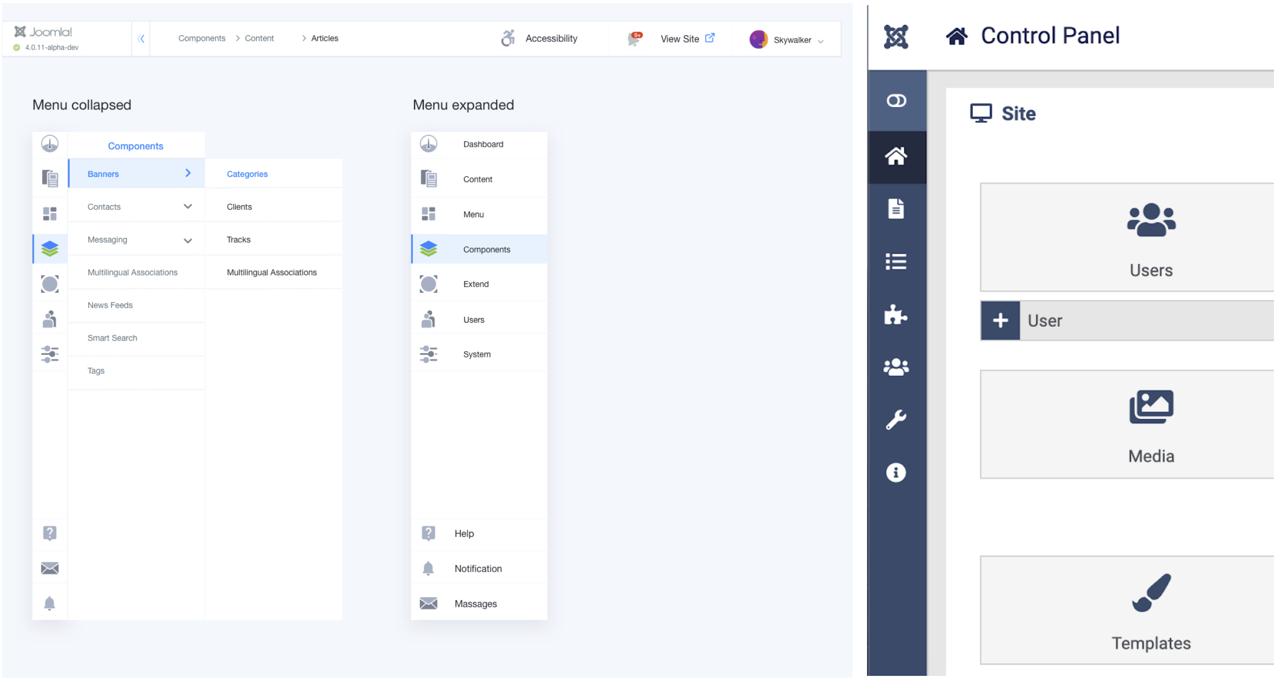
According to RTL Designing, a users’ focus point starts from the top left corner of a page and ends at the lower right. The inner content workflow has been designed accordingly. We have also used only one primary button to improve user concentration on every inner page.

We followed F Pattern for navigation, below is a comparison with the previous design.
Before
After
Below is an explanation of the design principles according to a numerical order.
Design Principles
-
There are three things we considered while designing the primary button.
-
We placed the primary button on the upper right corner and made it distinguishable from all other buttons. This Admin UI consists of only one primary button, unlike the previous design.
-
We removed unnecessary icons like Save, as icons are not universal they increase visual clutter.
-
Instead of making several actions that are linked to one basic primary action, we merged it all together into one primary button “Save”. This is how we reduced the cognitive load.
-
-
Placed all the secondary and tertiary buttons chronologically on the left. Except for Close, since it’s more relevant to the primary action.
-
Reduced tabs since tabs tend to hide information.
-
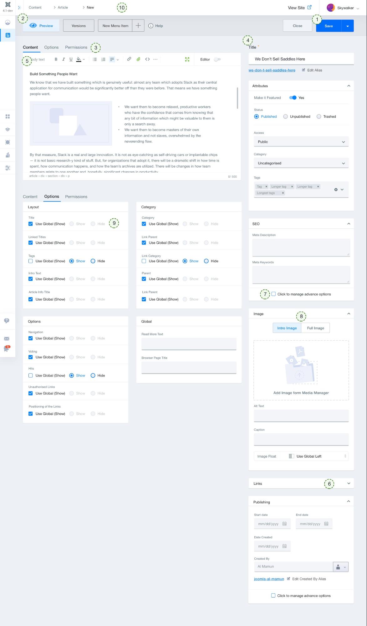
The tabbed information is brought upfront so that it is always available. They are added to the right sidebar. This functionality includes SEO, Images, Links, and Publishing.
-
Article Editor: Most essential options are kept on the frontline whereas less frequently used options are hidden under an overflow menu. So that users’ don’t get overwhelmed with too many functions.
-
All the options on the right sidebar are collapsible so that you can only focus on the tast at hand.
-
Placed the Advanced Options as optional since these are less frequently used features for most users.
-
We merged several different options under one title like images to help organize things better. Also, this reduces memory load.
-
By effectively using the checkbox and radio buttons, we made all information visible so that a user’s decision-making process gets easier and faster.
-
Breadcrumb: In order to easily understand where you are in the workflow, we have added Breadcrumbs.
To align with the design principle, the listing page has been redesigned as well. An effective table design with a very specific goal in mind, that is precise information skimming following a user’s natural eye path. Hence, a user can all the information you need and can access individual articles without being overwhelmed by the information.
We have introduced text-overflow in case of large cases like Article title. Also, made it easier to select a single article by hovering over a particular article card. We made every article distinguishable maintaining the overall uniformity. Below is a comparison with the previous design.
Before
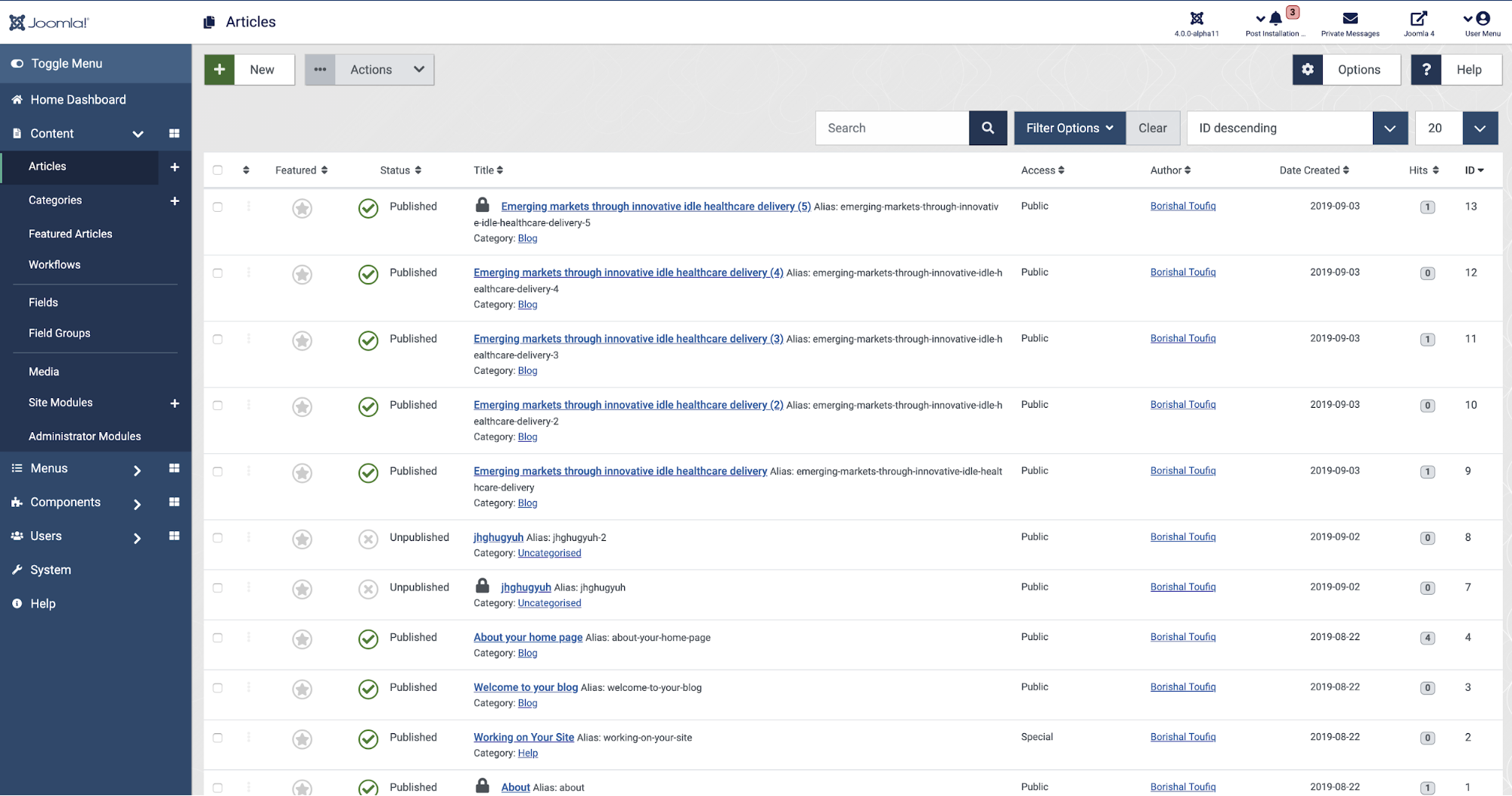
After
Below is an explanation of the design principles according to a numerical order.
Design Principles
-
We have compartmentalized every article so that we can visually differentiate them easily yet look uniform and easy to skim.
-
We reduced feature redundancy by removing all the features from the listing section that are available under batch select.
-
Table sorting: Sorting was difficult since there was a repetitive chronological order. Instead of skimming through the list, now you just need to click on one button to sort the way you want.
-
Searching and Filtering: We repositioned the sear bar to the upper right corner so that it’s easily accessible (following the natural approach). The searching and filtering now work simultaneously across all search results whereas previously the filtering was only applicable to the resulted visible portion of the table.
-
Considering the new Workflow under Content we redesigned a more accessible Status option through dropdown without changing the core Status workflow.
-
Pagination: Rearreged the pagination at the bottom of the table and made all the pages accessible through selection rather than a dropdown. We also gave the freedom to choose how many pages to show in a single view and made the information visible about the number of pages available.
-
Options: We have put all the options menu under the Option button. So that you don’t have to go to another page and select the specific tab to complete an action. (To be implemented).
-
Quick Action: Added a quick action to every list element so that they don’t have to go to the action menu for every item they select. (To be implemented)
The design of the Admin UI is accessibility centric. It has got the utmost importance. We tried to implement every WCAG 2.1 accessibility checklist on our design.
WCAG 2.1 level AA requires a contrast ratio of at least 4.5:1 for normal text and 3:1 for large text, and a contrast ratio of at least 3:1 for graphics and user interface components (such as form input borders). Level AAA requires a contrast ratio of at least 7:1 for normal text and 4.5:1 for large text.
Large text is defined as 14 point (typically 18.66px) and bold or larger, or 18 point (typically 24px) or larger.
Since we gave Accessibility the utmost importance, we assigned an entire menu for Accessibility on the top bar. From where you can customize your accessibility need as you seem fit. The features listed below are added to the Accessibility menu.
-
Content Scaling
-
Disable Motion
-
Big Cursor
-
Mouse Pointer Highlighter
-
Increased Contrast Scale
-
Magnifier
-
Dark Mode (will be implemented)
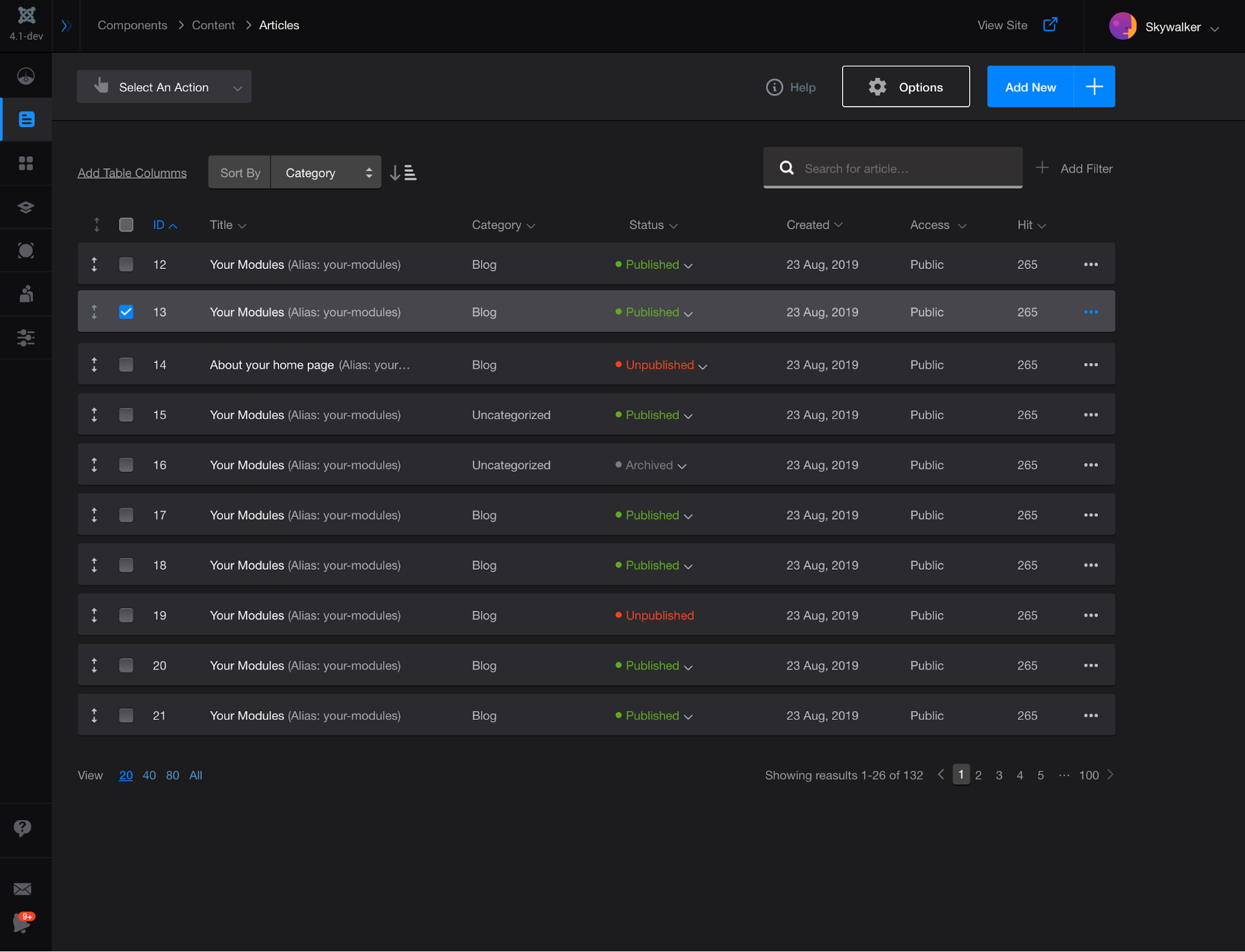
Image: A view of the upcoming Dark Mode
We did not yet implement everything on the checklist from a graphical point of view. They are being implemented. The design is implemented based on the following four principles.
-
Principle 1: Perceivable
-
Principle 2: Operable
-
Principle 3: Understandable
-
Principle 4: Robust
The principles leveled AA will definitely be implemented whereas we will try to implement the rest. Below is the checklist we will be implementing.
-
Principle 1: Perceivable - Information and user interface components must be presentable to users in ways they can perceive.
-
Guideline 1.1 Text Alternatives: Provide text alternatives for any non-text content so that it can be changed into other forms people need, such as large print, braille, speech, symbols or simpler language.
-
1.1.1 Non-text Content. All non-text content that is presented to the user has a text alternative that serves the equivalent purpose. (Level A)
-
Guideline 1.2 Time-based Media: Provide alternatives for time-based media.
-
1.2.1 Audio-only and Video-only (Prerecorded). For prerecorded audio-only or video-only media, an alternative provides equivalent information. (Level A)
-
1.2.2 Captions (Prerecorded). Captions are provided for all prerecorded audio content in synchronized media. (Level A)
-
1.2.3 Audio Description or Media Alternative (Prerecorded). An alternative for time-based media or audio description of the prerecorded video content is provided for synchronized media. (Level A)
-
1.2.4 Captions (Live). Captions are provided for all live audio content in synchronized media. (Level AA)
-
1.2.5 Audio Description (Prerecorded). Audio description is provided for all prerecorded video content in synchronized media. (Level AA)
-
Guideline 1.3 Adaptable: Create content that can be presented in different ways (for example simpler layout) without losing information or structure.
-
1.3.1 Info and Relationships. Information, structure, and relationships conveyed through presentation can be programmatically determined or are available in text. (Level A)
-
1.3.2 Meaningful Sequence. When the sequence in which content is presented affects its meaning, a correct reading sequence can be programmatically determined. (Level A)
-
1.3.3 Sensory Characteristics. Instructions provided for understanding and operating content do not rely solely on sensory characteristics of components such as shape, size, visual location, orientation, or sound. (Level A)
-
1.3.4 Orientation. Content does not restrict its view and operation to a single display orientation, such as portrait or landscape. (Level AA) WCAG 2.1*
-
1.3.5 Identify Input Purpose. The purpose of each input field that collects information about the user can be programmatically determined when the field serves a common purpose. (Level AA) WCAG 2.1*
-
Guideline 1.4 Distinguishable: Make it easier for users to see and hear content including separating foreground from background.
-
1.4.1 Use of Color. Color is not used as the only visual means of conveying information, indicating an action, prompting a response, or distinguishing a visual element. (Level A)
-
1.4.2 Audio Control. If any audio plays automatically for more than 3 seconds, either a mechanism is available to pause or stop the audio, or a mechanism is available to control audio volume independently from the overall system volume level. (Level A)
-
1.4.3 Contrast (Minimum). The visual presentation of text and images of text has a contrast ratio of at least 4.5:1, with a 3:1 ratio for large-scale text. (Level AA)
-
1.4.4 Resize text. Text can be resized without assistive technology up to 200 percent without loss of content or functionality. (Level AA)
-
1.4.5 Images of Text. If the technologies being used can achieve the visual presentation, text is used to convey information rather than images of text. (Level AA)
-
1.4.10 Reflow. Content can reflow without loss of information or functionality, and without requiring scrolling in two dimensions. (Level AA) WCAG 2.1*
-
1.4.11 Non-text Contrast. The parts of graphical objects required to understand the content, and the visual information required to identify UI components and states, have a contrast ratio of at least 3:1 against adjacent colors. (Level AA) WCAG 2.1*
-
1.4.12 Text Spacing. No loss of content or functionality occurs when users change letter, word and paragraph spacing, as well as line height. (Level AA) WCAG 2.1*
-
1.4.13 Content on Hover or Focus. Where hover or focus actions cause additional content to become visible and hidden, the additional content is dismissable, hoverable and persistent. (Level AA) WCAG 2.1*
-
Principle 2: Operable - User interface components and navigation must be operable.
-
Guideline 2.1 Keyboard Accessible: Make all functionality available from a keyboard.
-
2.1.1 Keyboard. All functionality of the content is operable through a keyboard interface without requiring specific timings for individual keystrokes. (Level A)
-
2.1.2 No Keyboard Trap. If keyboard focus can be moved to a component using a keyboard interface, then focus can be moved away from that component using only a keyboard interface, and, if it requires more than unmodified arrow or tab keys or other standard exit methods, the user is advised of the method for moving focus away. (Level A)
-
2.1.4 Character Key Shortcuts. If a keyboard shortcut is implemented using only letter, punctuation, number or symbol characters, then the shortcut can be turned off, remapped or activated only on focus. (Level A) WCAG 2.1*
-
Guideline 2.2 Enough Time: Provide users enough time to read and use content.
-
2.2.1 Timing Adjustable. For each time limit that is set by the content, the user can turn off, adjust, or extend the limit. (Level A)
-
2.2.2 Pause, Stop, Hide. For moving, blinking, scrolling, or auto-updating information, the user can pause, stop or hide it, or control the update frequency. (Level A)
-
Guideline 2.3 Seizures and Physical Reactions: Do not design content in a way that is known to cause seizures or physical reactions.
-
2.3.1 Three Flashes or Below Threshold. Content does not contain anything that flashes more than three times in any one second period, or the flash is below the general flash and red flash thresholds. (Level A)
-
Guideline 2.4 Navigable: Provide ways to help users navigate, find content, and determine where they are.
-
2.4.1 Bypass Blocks. A mechanism is available to bypass blocks of content that are repeated on multiple Web pages. (Level A) N/A for non-web documents and software
-
2.4.2 Page Titled. Web pages, non-web documents, and software have titles that describe topic or purpose. (Level A)
-
2.4.3 Focus Order. If content can be navigated sequentially and the navigation sequences affect meaning or operation, focusable components receive focus in an order that preserves meaning and operability. (Level A)
-
2.4.4 Link Purpose (In Context). The purpose of each link can be determined from the link text alone or from the link text together with its programmatically determined link context. (Level A)
-
2.4.5 Multiple Ways. More than one way is available to locate a Web page within a set of Web pages except where the Web page is the result of, or a step in, a process. (Level AA) N/A for non-web documents and software
-
2.4.6 Headings and Labels. Headings and labels describe topic or purpose. (Level AA)
-
2.4.7 Focus Visible. Any keyboard operable user interface has a mode of operation where the keyboard focus indicator is visible. (Level AA)
-
Guideline 2.5 Input Modalities: Make it easier for users to operate functionality through various inputs beyond keyboard.
-
2.5.1 Pointer Gestures. All functionality that uses multipoint or path-based gestures for operation can be operated with a single pointer without a path-based gesture. (Level A) WCAG 2.1*
-
2.5.2 Pointer Cancellation. For functionality that can be operated using a single pointer, completion of the function is on the up-event with an ability to abort, undo or reverse the outcome. (Level A) WCAG 2.1*
-
2.5.3 Label in Name. For user interface components with labels that include text or images of text, the accessible name contains the text that is presented visually. (Level A) WCAG 2.1*
-
2.5.4 Motion Actuation. Functionality that can be operated by motion can also be operated by user interface components, and the motion trigger can be disabled. (Level A) WCAG 2.1*
-
Principle 3: Understandable - Information and the operation of user interface must be understandable.
-
Guideline 3.1 Readable: Make content readable and understandable.
-
3.1.1 Language of Page. The default human language of Web pages, non-Web documents, or software can be programmatically determined. (Level A)
-
3.1.2 Language of Parts. The human language of each passage or phrase in the content can be programmatically determined. (Level AA)
-
Guideline 3.2 Predictable: Make content appear and operate in predictable ways.
-
3.2.1 On Focus. When any component receives focus, it does not initiate a change of context. (Level A)
-
3.2.2 On Input. Changing the setting of any user interface component does not automatically cause a change of context unless the user has been advised of the behavior before using the component. (Level A)
-
3.2.3 Consistent Navigation. Navigational mechanisms that are repeated on multiple Web pages within a set of Web pages occur in the same relative order each time they are repeated, unless a change is initiated by the user. (Level AA) N/A for non-web documents and software
-
3.2.4 Consistent Identification. Components that have the same functionality within a set of Web pages are identified consistently. (Level AA) N/A for non-web documents and software
-
Guideline 3.3 Input Assistance: Help users avoid and correct mistakes.
-
3.3.1 Error Identification. If an input error is automatically detected, the item that is in error is identified and the error is described to the user in text. (Level A)
-
3.3.2 Labels or Instructions. Labels or instructions are provided when content requires user input. (Level A)
-
3.3.3 Error Suggestion. If an input error is automatically detected and suggestions for correction are known, then the suggestions are provided to the user, unless it would jeopardize the security or purpose of the content. (Level AA)
-
3.3.4 Error Prevention (Legal, Financial, Data). For content that causes legal commitments or financial transactions for the user to occur, that modify or delete user-controllable data in data storage systems, or that submit user test responses, the user can reverse, correct, or confirm the action. (Level AA)
-
Principle 4: Robust - Content must be robust enough that it can be interpreted reliably by a wide variety of user agents, including assistive technologies.
-
Guideline 4.1 Compatible: Maximize compatibility with current and future user agents, including assistive technologies.
-
4.1.1 Parsing. In content implemented using markup languages, elements have complete start and end tags, elements are nested according to their specifications, elements do not contain duplicate attributes, and any IDs are unique, except where the specifications allow these features. (Level A)
-
4.1.2 Name, Role, Value. For all user interface components (including but not limited to: form elements, links and components generated by scripts), the name and role can be programmatically determined; states, properties, and values that can be set by the user can be programmatically set; and notification of changes to these items is available to user agents, including assistive technologies. (Level A)
-
4.1.3 Status Messages. In content implemented using markup languages, status messages can be programmatically determined through role or properties so that messages can be presented by assistive technologies without receiving focus. (Level AA) WCAG 2.1*
-
4.1.4 Accessibility-supported technologies only. Use accessibility-supported technologies. Any information or functionality that is implemented in technologies that are not accessibility supported must also be available via technologies that are accessibility supported.
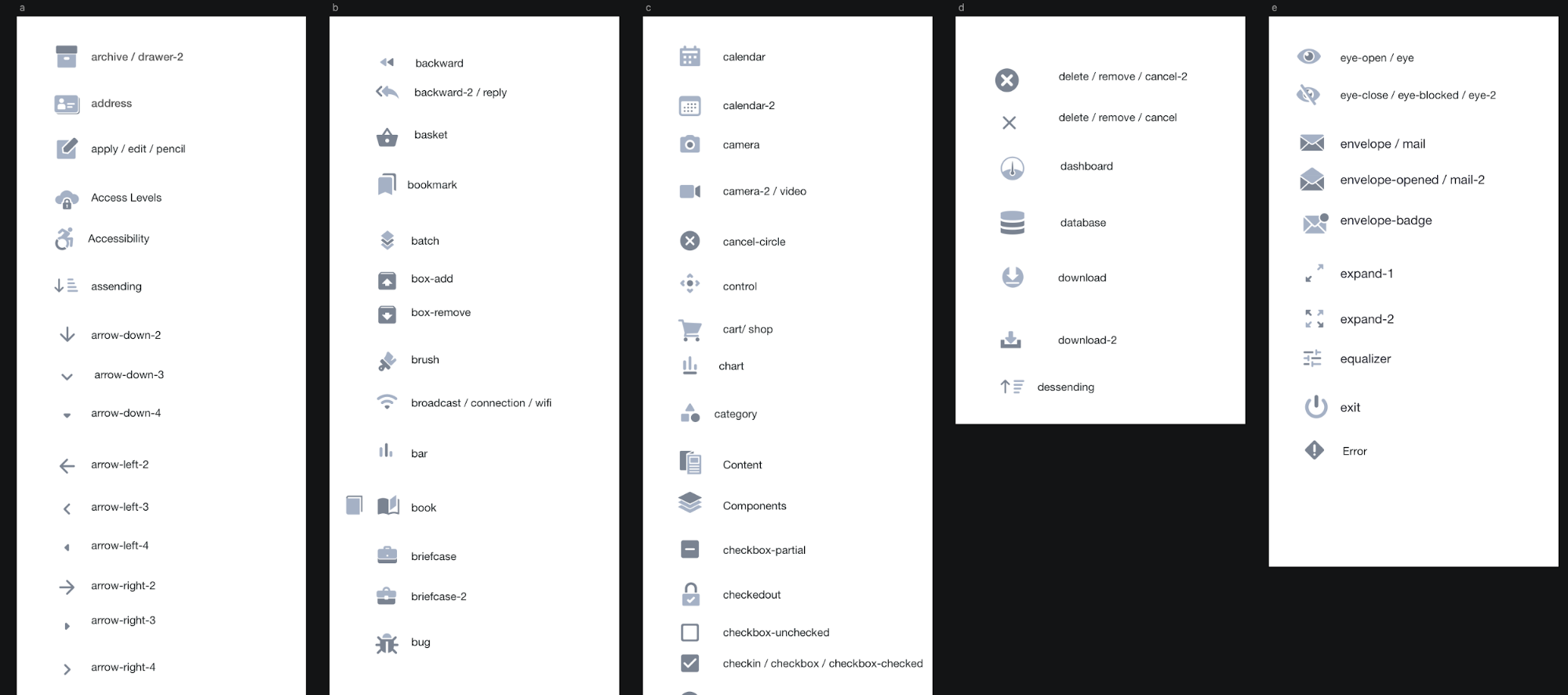
For conveying the brand personality, good icons are mandatory. It is absolutely necessary to create a visually pleasing icon for the overall aesthetic appeal of the design. Instead of using the bloated free version of FontAwesom. We tried to take off the memory load and design icons that align with the voice of our design. We tailor-made a new icon font library for the Admin UI template. The Joomla Iconfont consists of 426 infinitely scalable vector icons absolutely free to use. We will keep adding more icons if it’s necessary. This is the GitHub repo for Joomla Iconfont library.
The inner page of Menu items is designed with the same principles as the Listing Pages. However, there are a few interesting tweaks. Below is an explanation of the design principles according to a numerical order.

Design Principles
-
Add New Menu: We have introduced a revolutionary new way to add a new Menu Item without having to leave the listing page (will be implemented).
-
Previously, the Site Menu and Administrator Menu were in different locations but since they share similar functionalities. Both are placed all together in the inner Menu Listing page.
-
Link Module: We addressed a few issues with the Linked Module button like hover visibility and discoverability. Hence, we improved the findability by bringing it on the table list (to be implemented)
-
To quickly preview the menu all the menu items assigned to a particular menu, we have added a quick view button rather than redirecting users to another page.
Menu Creation Process
The menu creating process has been radically improved as well. Below is an explanation of the design principles according to a numerical order.

-
We have simplified the Menu Item Type selection process by introducing a dropdown menu instead of popup bars. By doing so, we have reduced the interaction cost in a significant amount.

-
The tabbed information is brought upfront so that it is always available. They are added to the right sidebar. This functionality includes Schedule, Link Options, Menu Selection and other options that are always visible for your convenience. Since they are collapsible, you can access them whenever you need to.
The Module section was included under the Content Section in the previous design. Since Content itself is a component, we have relocated it to a relevant area that is under the Extension section.
Before:
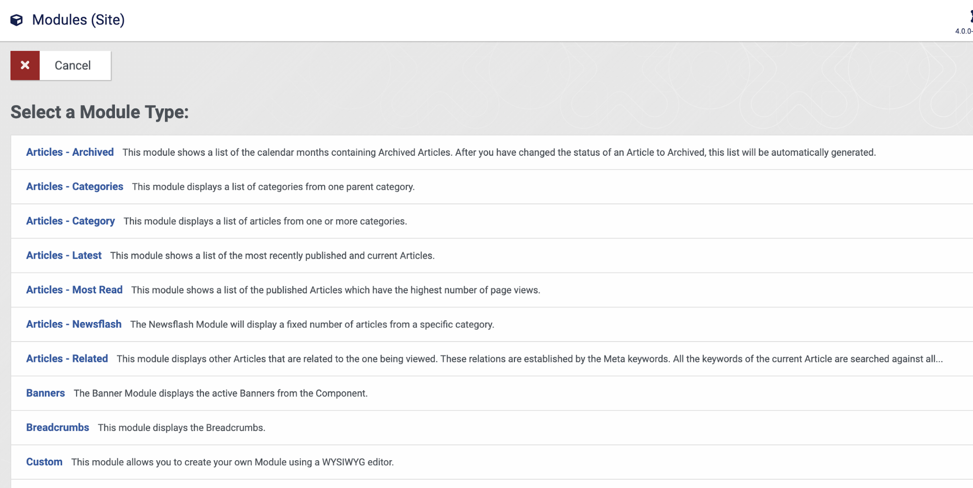
After:
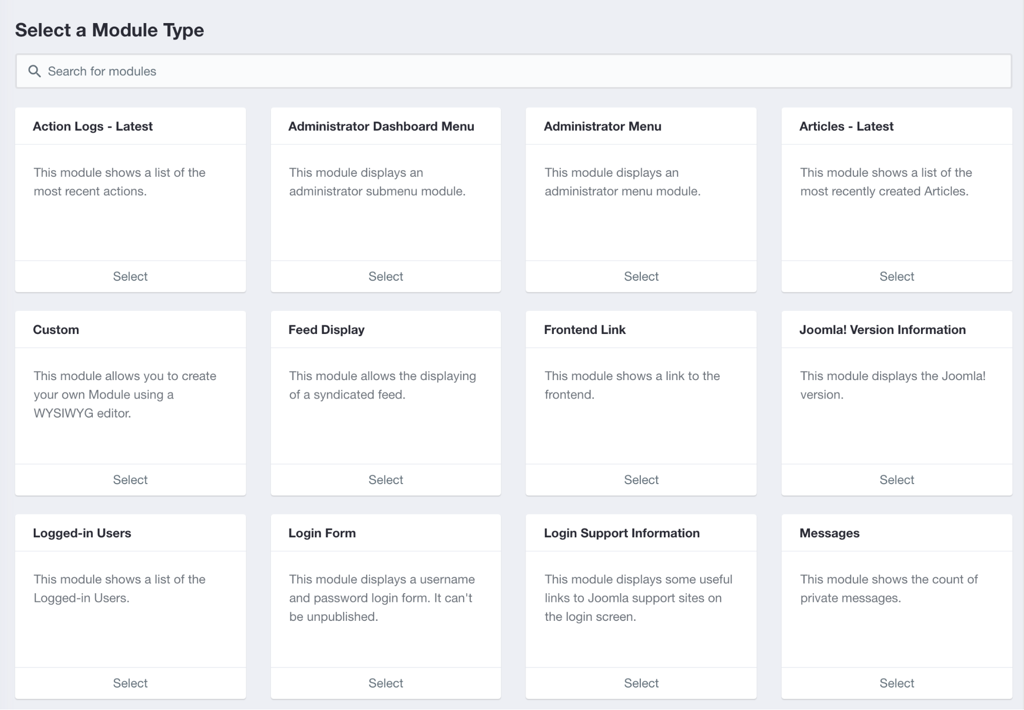
We have created a seamless Module selection process with integrated search. All the modules are listed in a popup so that users don’t need to leave the current page.
Module Assignment
We have redesigned the module assignment process to make it easier by creating a proper tree layout with cards.
Before:

After:

Before:
After:
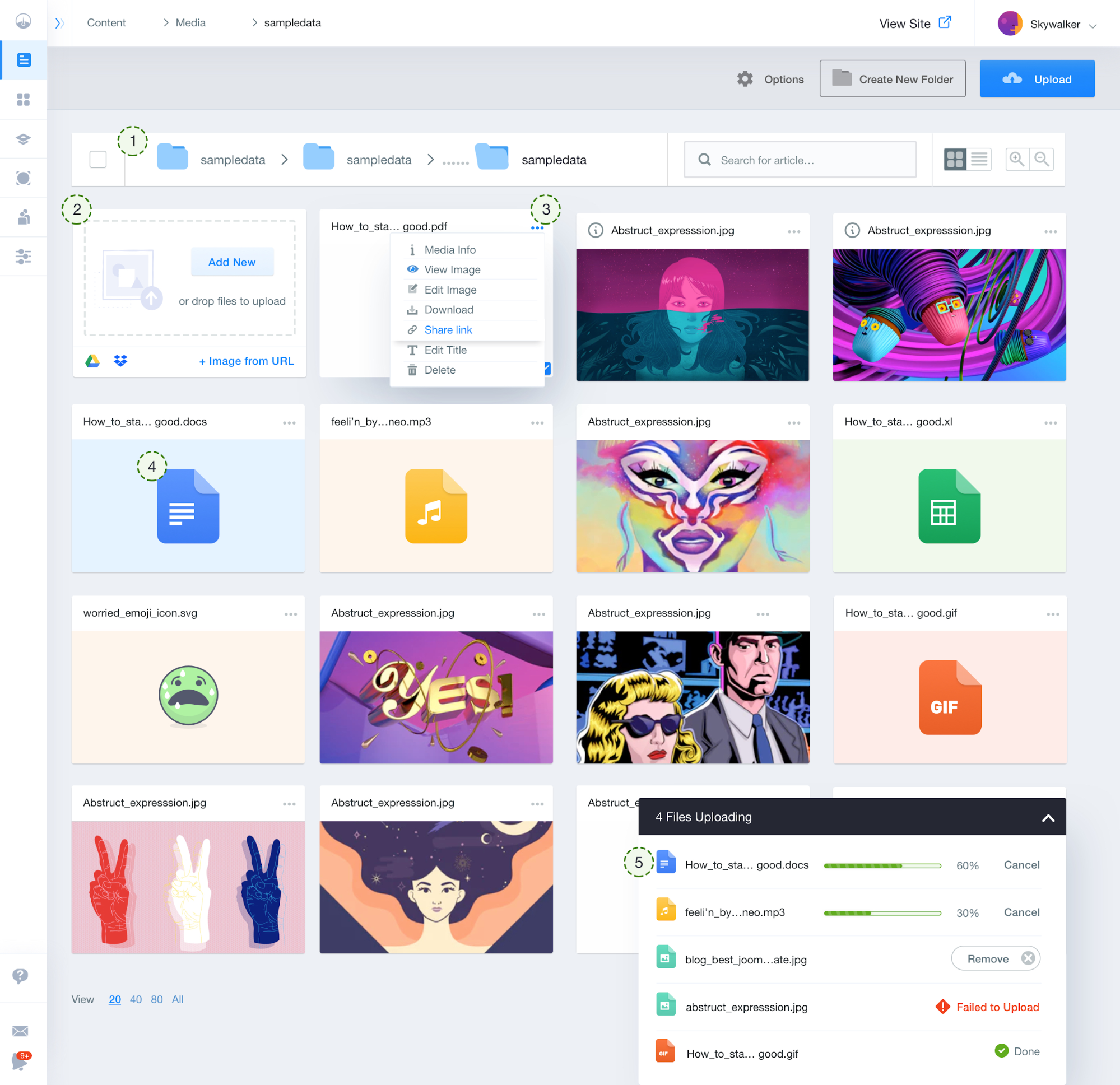
-
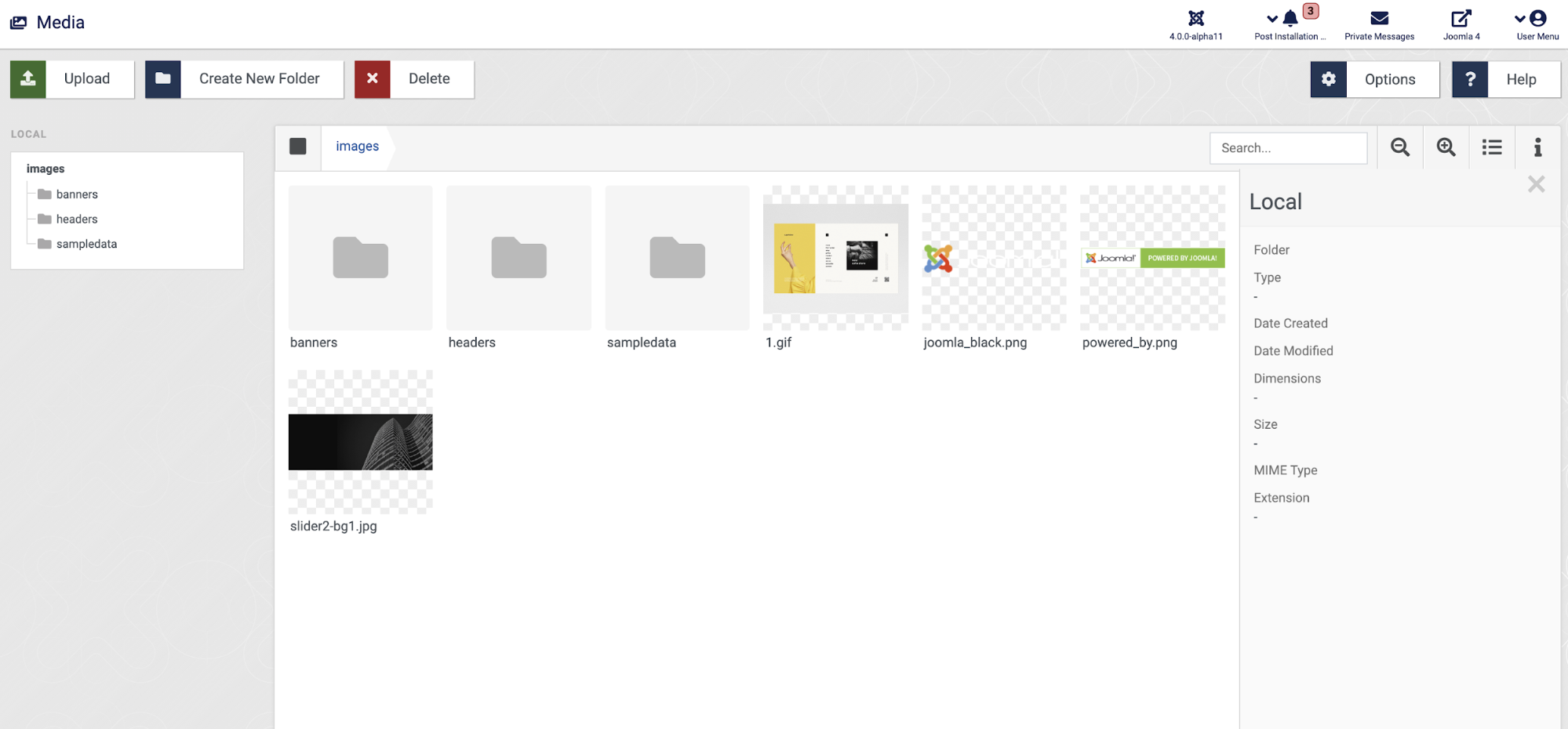
We have introduced a proper directory tree so that users know where a particular file is located when using one.
-
An advanced uploading option is introduced where users can use the drag and drop system for file uploading or use a URL or can just add a file directly from the cloud (will be implemented).
-
For quick action and media info, we have introduced an ellipsis menu for every media file.
-
We have specified a designated icon for every file type like docs, mp3, SVG, and others so that you can quickly recognize a file type just by looking at the icons.
-
We have added a collapsible modal for showing the users the progress of file uploading visually. This gives the users closure whereas previously there was no way to see the states. We have also introduced actionable insights and controls like Cancel and Remove.
The Template is placed under Extensions whereas it was previously placed under System. This makes the template installation process a lot easier. Below is an explanation of the design principles according to a numerical order.
Before:

After:

-
Add New Template: We have introduced a revolutionary new way to install a new Template without having to leave the existing page.
-
To view, identify, and select a template easier among the collection of templates, we have introduced a grid view system.
-
Redistributed the information in such a way that a user does not need to browse for documentation, template preview, and other template related information elsewhere. As they are carefully integrated with the template view.
-
Made related actions visible on the default template.
-
Placed a common button to make any other template the default one with just a click.
Instead of using a Dashboard for all the System functionalities, we have introduced an integrated menu for System so that the System functionalities are always accessible.
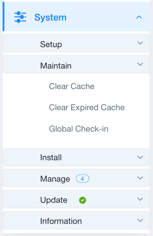
Before:

After:

Global Configuration
-
We have followed a user-centric approach while introducing the sidebar.
-
We rearranged the information architecture for improving findability and usability.
-
We properly utilized the concept of dropdown and radio buttons. And divided significant information in chunks.

We reverse-engineered the process of installation by bringing the warning message at the beginning of Joomla installation. As it becomes bothersome if the users are notified after installation that he/she needs to fix these warnings in order to properly run the site.
Progressive Disclosure
We introduced a whole new system in the installation process and calling it Progressive Disclosure so that you don’t get overwhelmed by form fields. We have divided the entire installation process into 5 consecutive steps.

We used all the best practices of UX for designing the form fields such as title on the top of the form fields, example text in the placeholder, and instruction at the bottom so that users’ can fill the form faster.
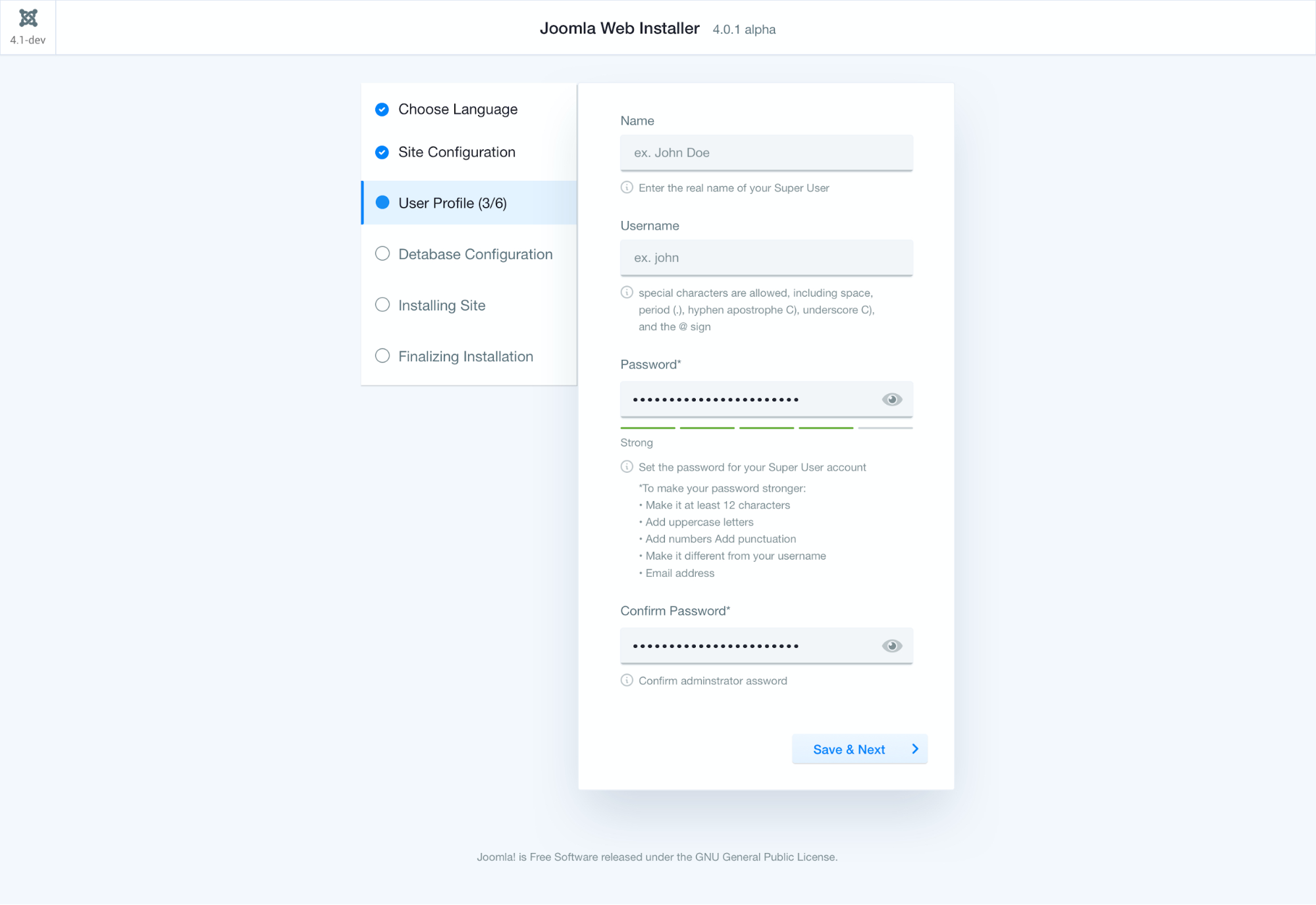
For error prevention, we have added things like view password and password indicator as users’ type.
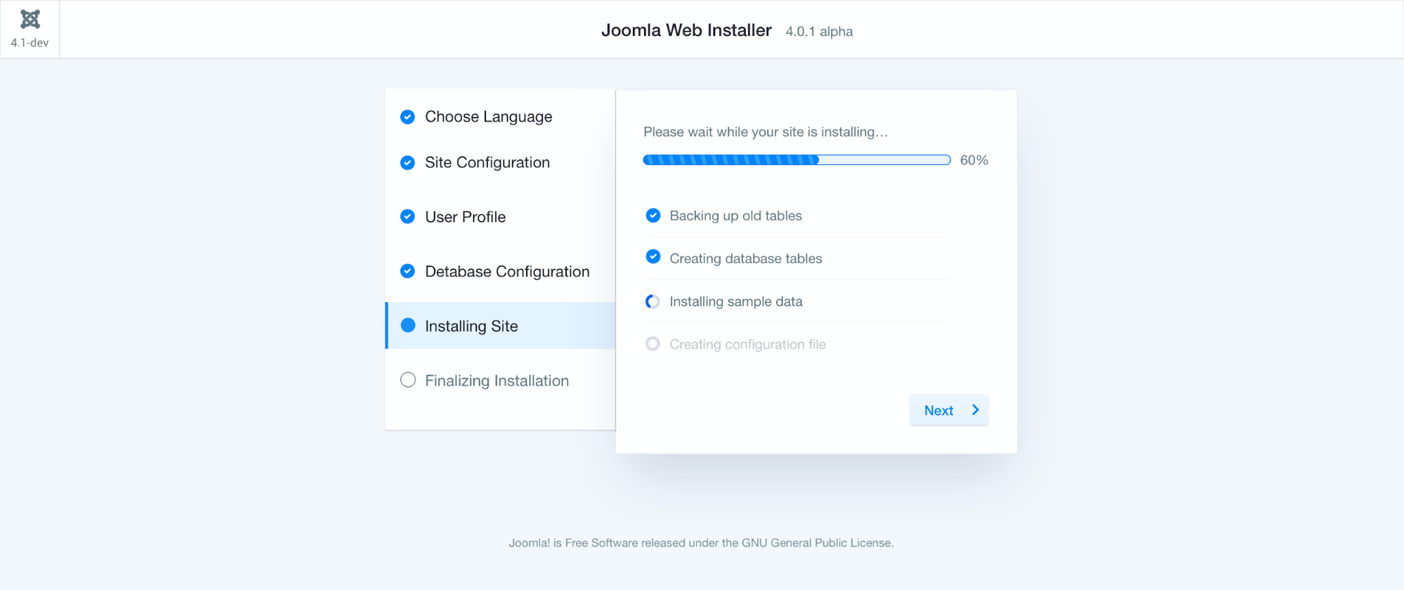
We have added a progress bar with relevant information in the installation process so that users get closure on their status.

While finalizing the installation process, we provided options to customize the installation and recommendations while providing buttons for redirecting to the admin page and open the live preview.
Admin Login
Before:

After:

Instead of showcasing information in an incoherent manner as in previous design, we merged all the information in a single viewport. Useful links like support forum, docs and news are arranged at the bottom. We also added some social proof to see as the user login to the system.

Or, we could just keep it simple by removing all the
clutters and keep it to its bear minimal version. This lets the user do
what they are here for.
The following Extension design is in the ideation process and yet to be implemented. We have breakdown the plan below.
Before:

After:

-
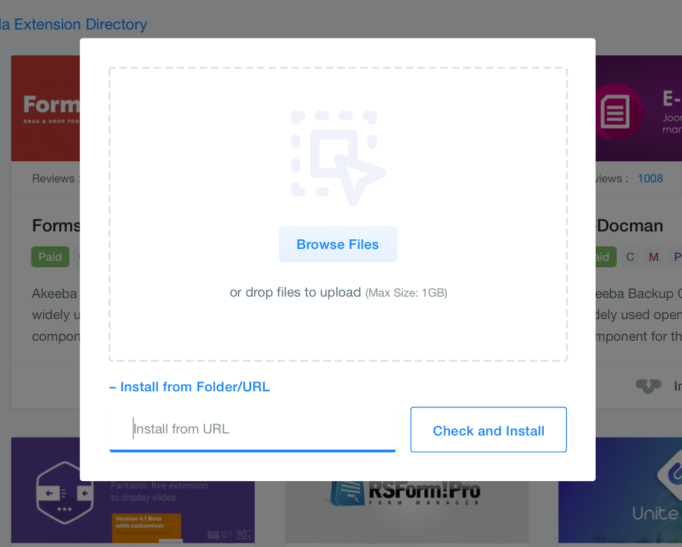
Add New Extension: We have introduced a revolutionary new way to install a new Extension without having to leave the existing page. This helped us remove the existing tabs like Upload from package, Install from URL during installations. And merged them together in a single popup.
-
We put the category option on the top left corner so it’s always easily accessible. And made it a collapsible menu with show/hide functionality. After hiding the category you’ll have more space to browse through extensions.
-
We have put reviews and scores right under the preview of extensions.
-
We have removed the visual clutter by using text-overflow and containing the description text within 3 lines.
-
For a faster installation process, we have added an installation button without having to go to the directory.
To summarize, we have taken a deeper look at Joomla infrastructure and identified its uniqueness. The tree-like data organization is what makes Joomla different from other CMSs. Developers have been the designers of our beloved community-driven Joomla CMS, which resulted in many functionalities yet increased a difficult workflow. Careless integration of new features could result in Joomla being just another CMS mirroring each other. Which should not happen. We have addressed these issues and incorporated design thinking into the areas where it was possible. With this design, we hope to regain its lost regime and put the crown back to Joomla as the CMS king.

