 |
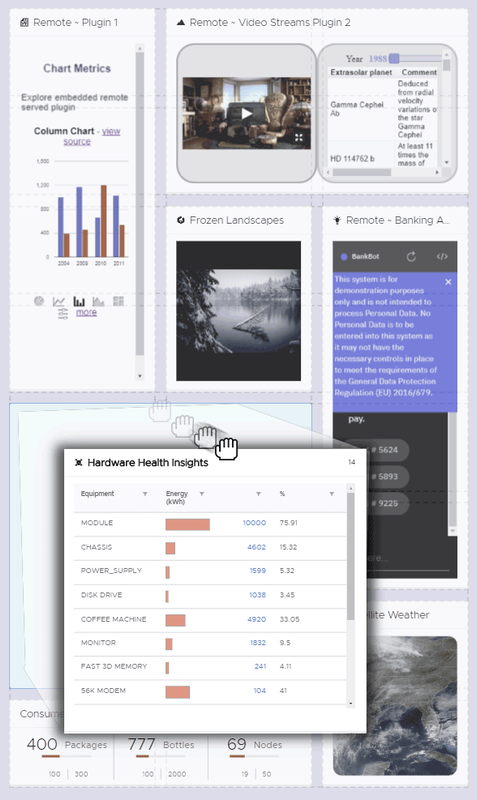
Welcome to the Angular card deck component! Want flexible, composible dashboards from a dynamic layout structure? This is the intermediate version for hungry developers |
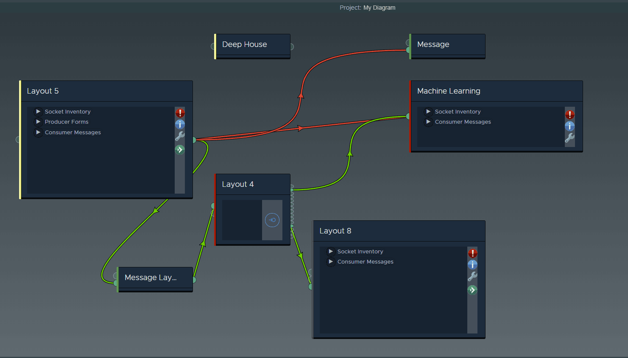
Want to extend with accessible, comprehensive linking for real time diagrams?
Then this component may offer a head start for scaling up to the demands of UI projects.
- Clone repo with
git clone git@github.com:mattmutt/ngx-card-deck-seed.git - Install Angular CLI if necessary, with
npm install -g @angular/cli - Grab all tooling and library dependencies
npm install - Start the development server with
npm start, then visit http://localhost:4200 in browser - Looking for simplicity? Explore a beginner-oriented basic sample on Github
- Browse across a few working card decks and diagrams on the hosted demo page.
- Angular 8
- Clarity 2
- RxJS 6
- Node.js 10+ ( Angular CLI requirements)
- ES2015 ( no need to support IE11 going forward? )
| Feature | Category | Description |
|---|---|---|
| Themes | experience | Can swap in various color or branded color themes, for example dark mode. Able to extend to other UI libraries, like Material |
| Accessibility | experience | Using keyboard alone, user can use <tab>, <enter> and four arrows keys to rearrange cards. The <esc> key breaks out of focus traps |
| Zoom | experience | For very complicated layouts, showing a scaled thumbnail can help visualize |
| Pan | experience | When resolution or container viewport size is limited, scrolling around can help show other cards easily |
| Layers | ui | Can program additional content above or behind the cards, for example diagrams and connectors |
| Localization | ui | Ability to render text in other languages. Could alternatively leverage Angular's official i18n build-time mechanism |
| Lazy loading | ui | Custom card components can be eagerly or loaded on demand, for example heavy views should be split to separate bundles for performance gains |
| Remote plugin views | ui | Easy to point to remotely served components. Todo: build library to synchronize theme changes |
| Metadata driven | developer | Two modular JSON-based formats for configuring a deck layout: a simplified and advanced (verbose, fine-grained) model. |
| Library packaged | developer | Code shipped as full source (for learning) or preferably consumed as a single library for clients in Angular Package Format. |
Follow the developer guide to integrate this library into a dashboard app. Walks through design, provisioning and component installation.
Run npm start or ng serve --configuration for a local development server. Navigate to http://localhost:4200. The app will automatically reload if you change
any of the source code files.
Run ng build to build a production grade package of the project. The build artifacts will be stored in the dist/ directory.
Run npm test to execute the unit tests of the component (in continuous watch mode loop) via Karma.
To validate the tests and exit upon completion, type npm test --no-watch
Run npm run e2e to execute the end-to-end tests via Protractor. Closest in terms of automating and detecting what front end steps actually happen.
Advised to write more unit tests as they can explore more scenarios and define the scope of the test at a more granular level.
Credits and inspirations:
Tiberiu, Clarity Design @ vmw, Angular Core Team @ google, NoFloJs tool, Flow-based programming @ ibm


