-
Notifications
You must be signed in to change notification settings - Fork 4
5. Cycle Time
The Cycle Time page provides insights for issues at Backlog level (Story, Bug, Task etc.). It excludes any levels higher such as Epic or Feature. Subtask issue type is not included in the dataset.
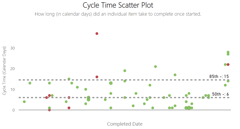
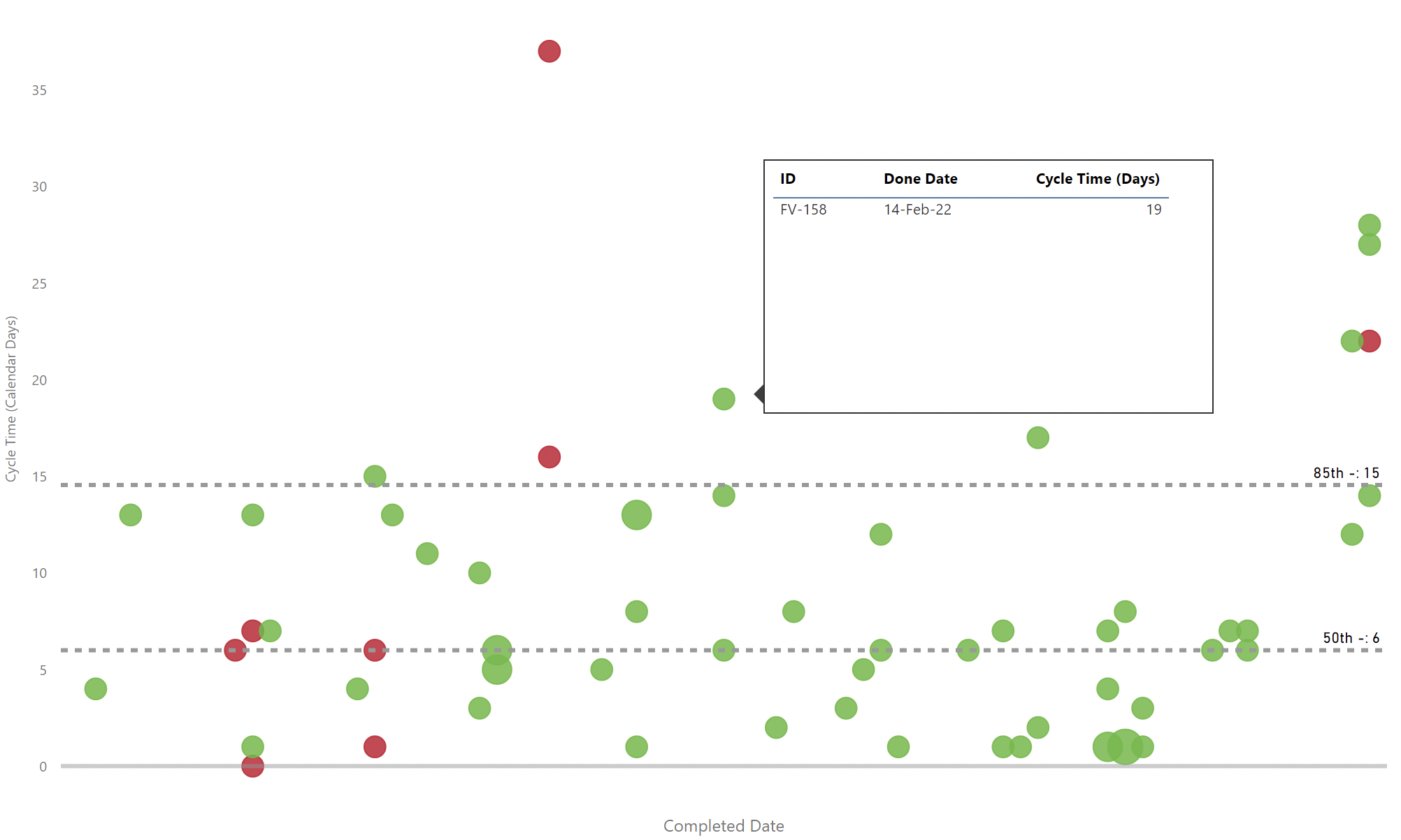
This chart shows the time it takes for an issue to go from an In Progress state category to a Completed state category. Each ‘dot’ represents an individual issue, with larger dots indicating where issues finished on the same date with the same cycle time. The tooltip provides the individual detail for that issue (or issues - if they have the same completed date and cycle time). The chart will also plot the 50th and 85th percentiles for all issues in the selected period.
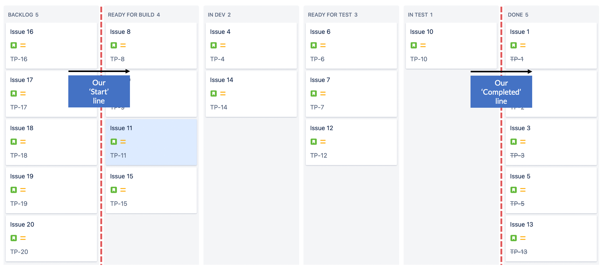
Cycle Time is the time (in calendar days) taken from when an issue first moves past our ‘Start’ line and over our ‘Completed’ line.
The intention is to use this to see if as a team you are becoming more responsive and more predictable in the time it takes to finish something. It can also provide useful input to stimulate discussion at a Retrospective, by focusing on why some of the outliers took so long to be completed. You can use the percentiles as an alternative to estimation, providing your stakeholders with differing confidence levels of completing an issue (i.e. if your 85th percentile is 15 days, then if you were to start an issue today there is an 85% likelihood it would take 15 days or less to deliver) to drive more open conversations.
When overdriven, your Quality metric goes up as more bugs are reported due to premature completion. Sustainability chart has higher peaks as more work completes but then work starts on more bugs that are opened.
It is gamed by only starting fast, simple work (seen by initial increasing Productivity only to regress later) and/or premature completion of issues (seen by growing Quality (Bug Rate) percentage).

This chart shows the time it takes for an issue to go from being Created to a Completed state category. Each ‘dot’ represents an individual issue, with larger dots indicating where issues finished on the same date with the same lead time. The tooltip provides the individual detail for that issue (or issues - if they have the same completed date and lead time). The chart will also plot the 50th and 85th percentiles for all issues in the selected period.
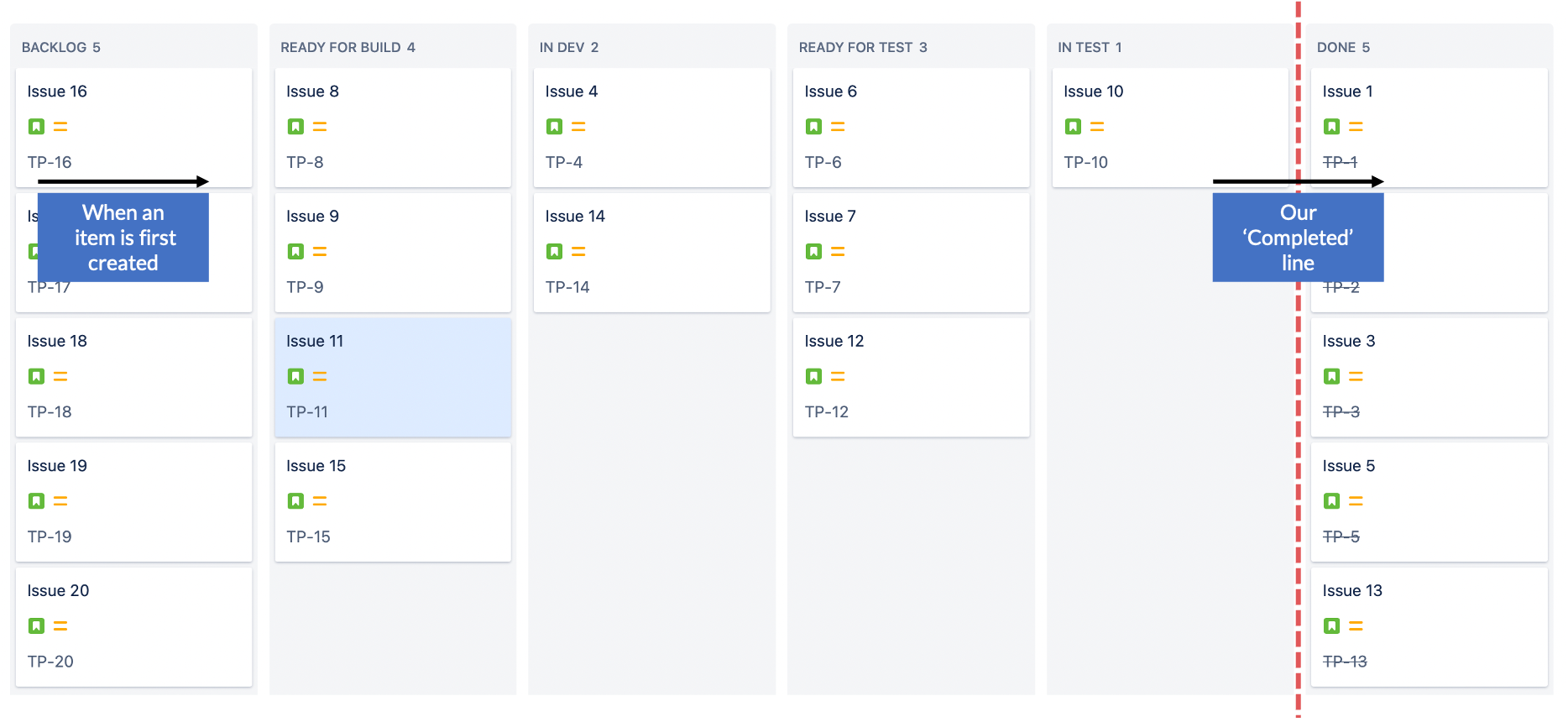
Lead Time is the time (in calendar days) taken from when an issue is first created (i.e. gets added to the Kanban board/backlog) and over our ‘Completed’ line.
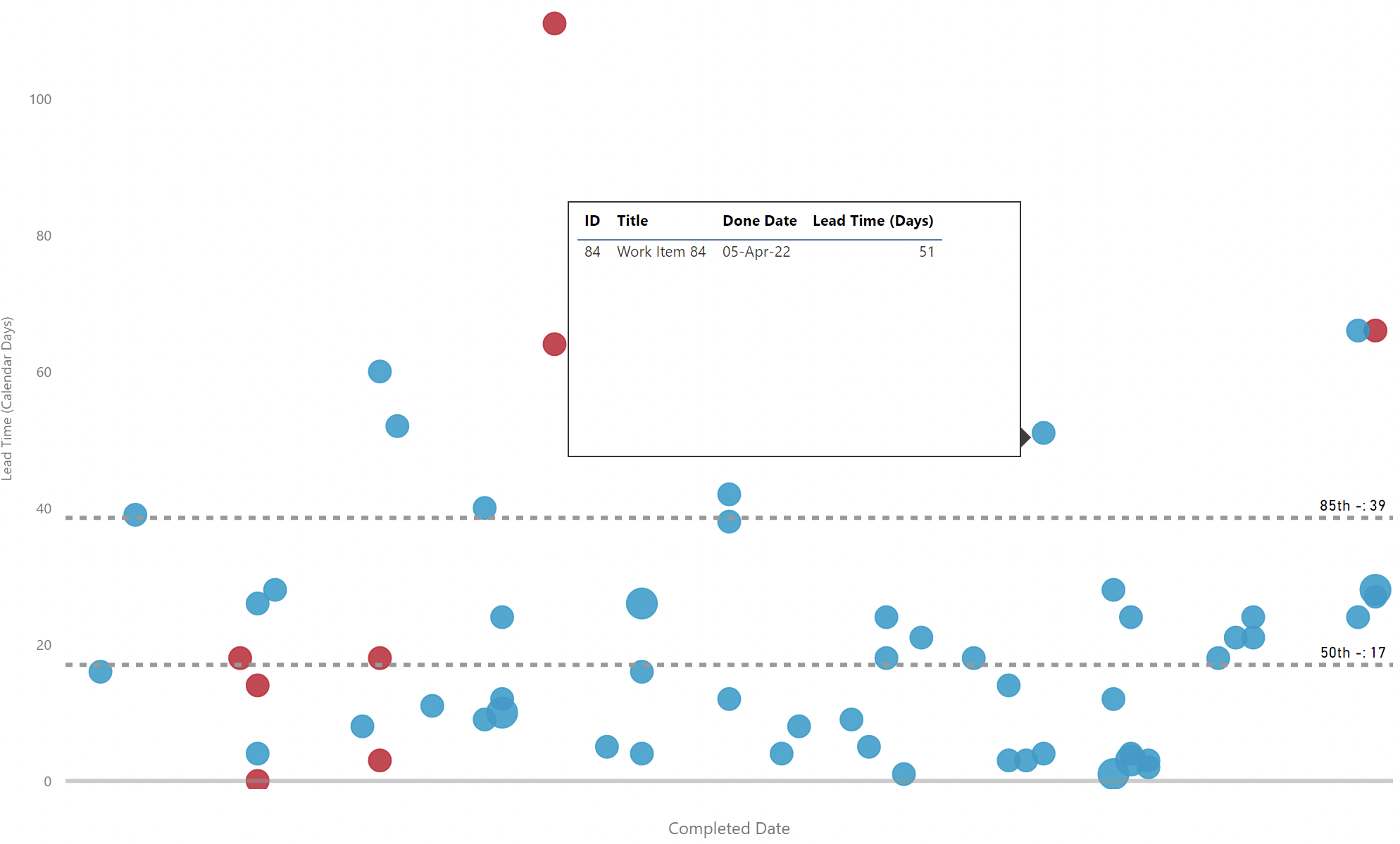
The intention is use this to see if as a team the end-to-end flow of work is becoming more responsive and more predictable in the time it takes to finish something from when it is first created on the backlog. Compare the percentiles with the cycle time scatter plot to see if there may be upstream (before work starts) bottlenecks in your process. It also can provide useful input to stimulate discussion at a Retrospective, by focusing on why some of the outliers took so long to be completed. You can use the percentiles as an alternative to estimation, providing your stakeholders with differing confidence levels of completing an issue to drive more open conversations.
When overdriven, your Quality metric goes up as more bugs are reported due to premature completion. Sustainability chart has higher peaks as more work completes but then work starts on more bugs that are opened.
It is gamed by only starting fast, simple work (seen by initial increasing Productivity only to regress later) and/or premature completion of issues (seen by growing Quality (Bug Rate) percentage).
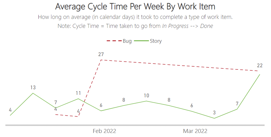
This chart shows, for the completed (done/closed) issues in a particular week, what was the Average Cycle Time for those issues, which is then split by Work Item (Issue) Type. It takes the Cycle Time calculation and plots the average for those issues (split by issue type).
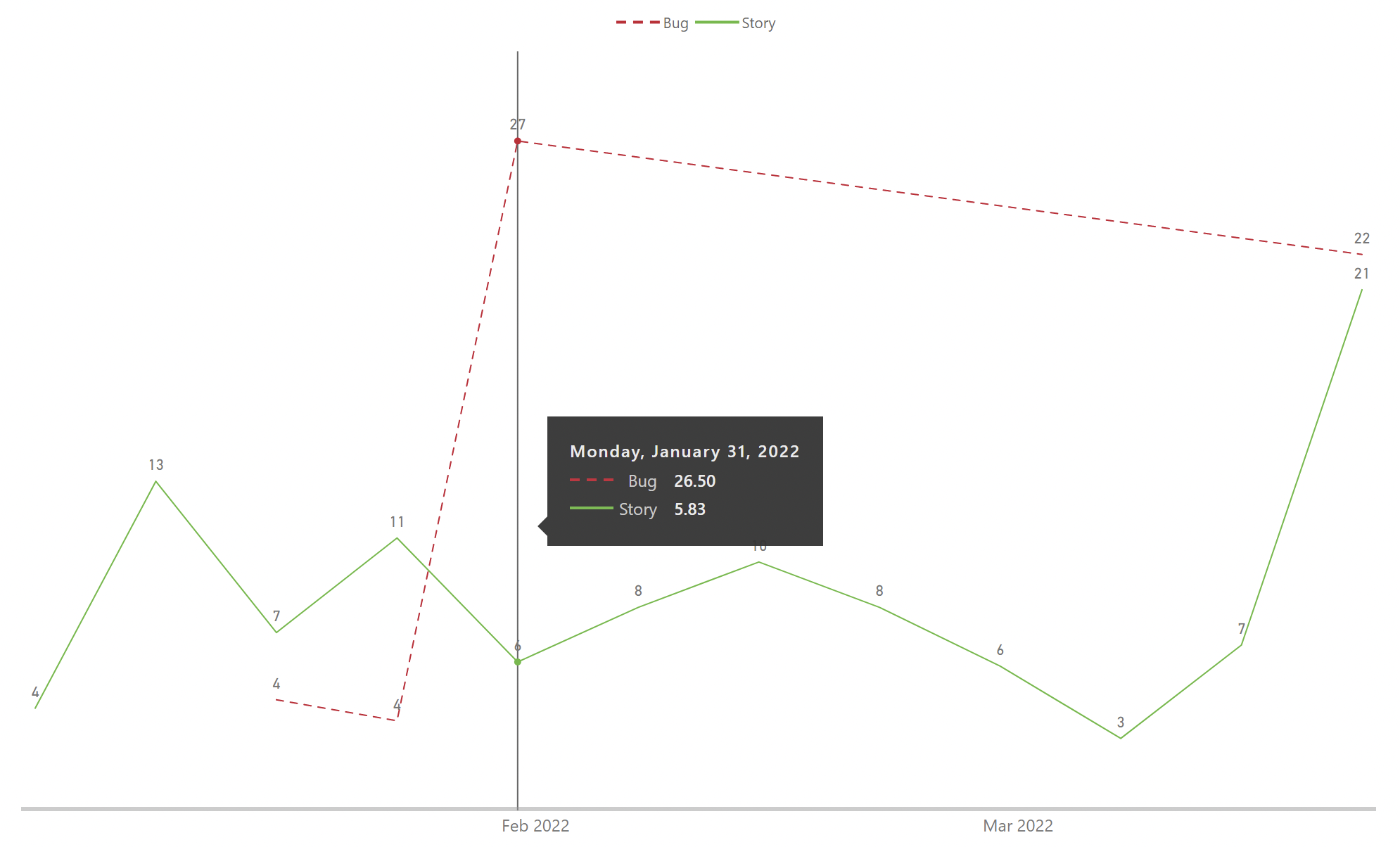
The intention is to identify the trends over time, whilst also looking at individual weeks to see if there are any outliers (use the scatter plot below this chart to deep dive into the data). Analyse if there are differences in cycle time due to types of work and use this to have more open conversations, potentially as an input to a Retrospective.
When overdriven, your Quality metric may go up as more bugs are reported due to premature completion. Sustainability chart has higher peaks as more work completes but then work starts on more bugs that are opened.
It is gamed by only starting fast, simple work (seen by initial increasing Productivity only to regress later) and/or premature completion of issues as completed (seen by growing Quality (Bug Rate) percentage).

This chart shows, for the completed (done/closed) issues in a particular week, what was the Average Lead Time for those issues, which is then split by Work Item (Issue) Type. It takes the Lead Time calculation and plots the average for those issues (split by issue type).
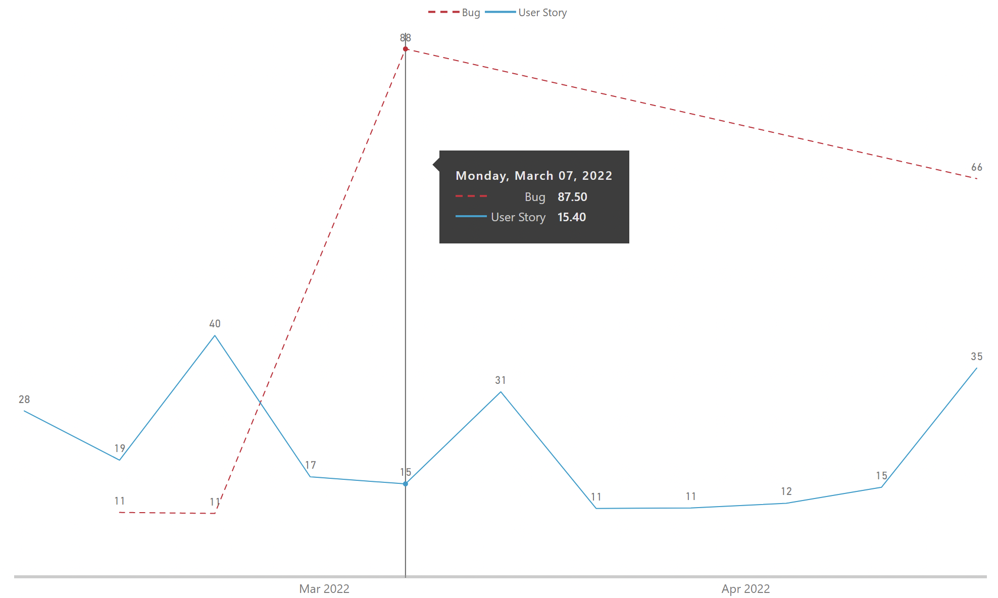
The intention is to identify the trends over time, whilst also looking at individual weeks to see if there are any outliers (use the scatter plot below this chart to deep dive into the data). Analyse if there are major differences between the average lead time compared to the average cycle time.
When overdriven, your Quality metric may go up as more bugs are reported due to premature completion. Sustainability chart has higher peaks as more work completes but then work starts on more bugs that are opened.
It is gamed by only starting fast, simple work (seen by initial increasing Productivity only to regress later) and/or premature completion of issues (seen by growing Quality (Bug Rate) percentage).