-
Notifications
You must be signed in to change notification settings - Fork 883
MaterialToast
DianeXceed edited this page Jun 19, 2017
·
2 revisions
Only available in the Plus Edition
Derives from ContentControl
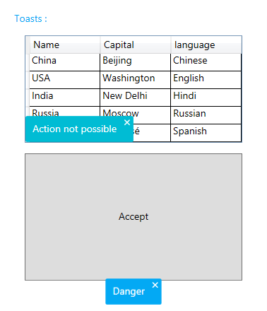
The MaterialToast represents a ContentControl that can be used to display content in any corner or any window or FrameworkElement. It uses the material colors and animations.

| Property | Description |
|---|---|
| CloseButtonStyle | Gets or sets the style to use for the close button. |
| CornerRadius | Gets or sets the control's corner radius. |
| DisplayTime | Gets or sets the number of milliseconds the control will remain visible. |
| HideOnClick | Gets or sets a value indicating whether the control can be closed with a mouse click. |
| IsCloseButtonVisible | Gets or sets a value indicating whether the close button will be shown in the control. |
| IsOpen | Gets or sets a value indicating whether the controls is shown. |
| Location | Gets or sets the location of the control relative to its owner. |
| MaterialAccent | Gets or sets a value representing the material color palette that will be applied to the control. |
| MaterialAccentBrush | Gets or sets the color that will be used as the control's background. |
| MaterialForeground | Gets or sets the color to use as the control's foreground. |
| Owner | Gets or sets the owner of the control, which is the element from which it will popup. |
| Method | Description |
|---|---|
| HideToast | Hides the control. |
| ShowToast | Displays the control. |
| Event | Description |
|---|---|
| HideCompleted | Raised when the control has been hidden. |
| ShowCompleted | Raised when the control is shown. |